1.0 Overview
1.1 Background
The LinkedIn and World Bank Group have partnered and released data from 2015 to 2019 that focuses on 100+ countries with at least 100,000 LinkedIn members each, distributed across 148 industries and 50,000 skill categories. This data aims to help government and researchers understand rapidly evolving labor markets with detailed and dynamic data (The World Bank Group, 2021).
1.2 Data
The proposed datasets for analyses will mainly come from the LinkedIn-World Bank partnership. This will be complemented with GDP per capita from World Bank.
In this assignment, the following datasets from LinkedIn-World Bank will be used:
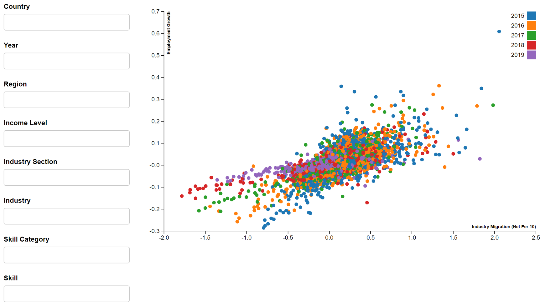
- Industry Employment Growth: Growth rate of employment in each industry in each country from 2015-2019 (78 distinct industries)
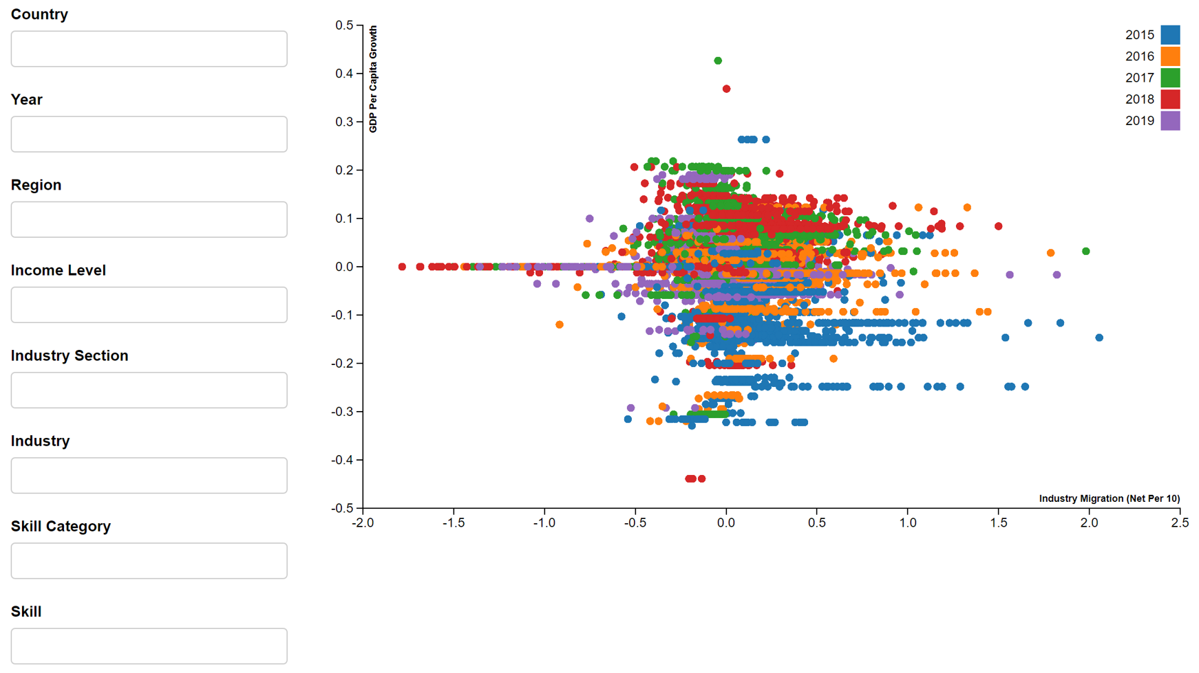
- Industry Migration: Change in number of people in each industry in each country from 2015-2019
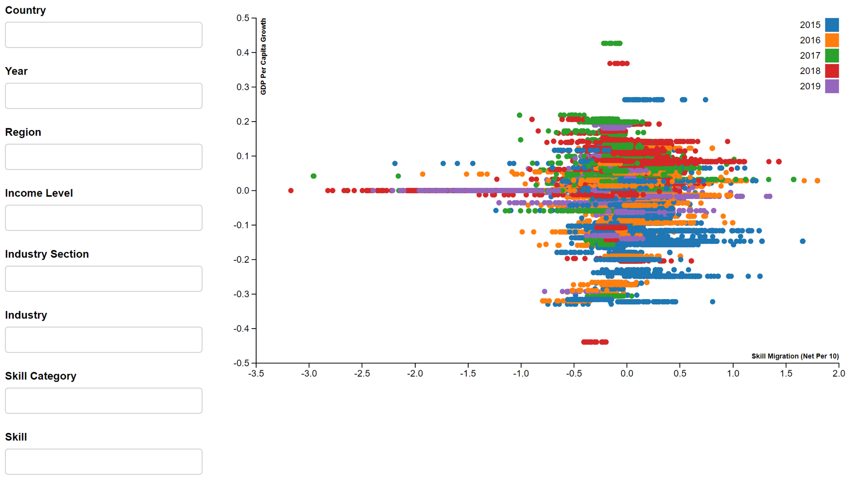
- Skill Migration: Change in number of people with each skill in each country from 2015-2019
- Industry Skills Need: Top 10 skills required in each industry from 2015-2019
The GDP per capita dataset, which comprises annual time-series GDP per capita (current USD) for countries, is also used.
1.3 Critiques of Existing Data Visualisations
Simple data visualisations are publicly available at LinkedIn-World Bank webpage. However, they are limited in the exploration of trends because they only allow one parameter of choice.
In terms of how variables relate to one another, there are limitations to studies done so far. Studies on relationship between GDP per capita growth rate and population growth are usually done at country level, so more studies can be done to analyse the relationship between GDP per capita growth rate and employment growth or migration in each industry. Figure 1 shows the relationship between employment growth and interstate migration (Tunny, G., 2015). Here, analysis is done at state level, but not industry level.
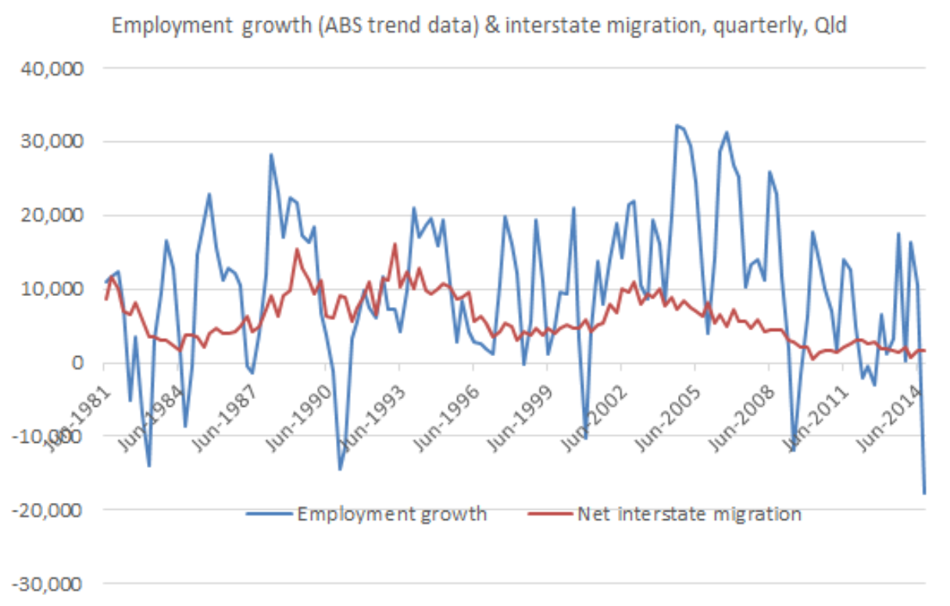
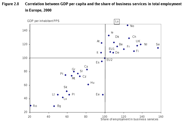
Figure 2 shows the relationship between GDP per capita and share of employment in business services in 2000 for countries in Europe Kox, H. & Rubalcaba, L., 2007. However, this does not show how a change in migration or employment growth in an industry will cause the change in GDP per capita.
Overall, these data visualisations mentioned are static and do not allow readers to find out how the change in GDP per capita is influenced by the change in employment and migration in each industry or skill and how the change in employment in influenced by change in migration in each industry or skill.
1.4 Motivation
Through this project, we will create a user-friendly, interactive and reactive dashboard that allows individuals and countries to view their competitive advantage and understand the evolving labour markets across the world in four areas: skills, occupations, migration and industries. Comparison will be allowed at both country-level and industry-level. The project will help answer the following questions:
For individuals:
- [1A] Increasing employability - What are the highly sought-after skills to build up to increase employability in a particular country or a particular sector?
- [1B] Employment opportunities - Which country holds better employment opportunities for certain skills or certain industry?
- [1C] Migration Trends - Which country are people e.g. fellow countrymen, migrating to?
For countries:
- [2A] Migration Trends - Where are our (country’s) talent migrating to?
- [2B] Skill Trends - What are the skills lost or gained in our country or in the sectors in our country?
- [2C] Learning from other countries - Which skills (i.e. top skill needs in each industry) do we encourage and train in our own people to increase the competitiveness of our labour market against other countries?
- [2D] Skill and Industry Trends - Are we losing or gaining the skills or industries we desire and according to plan? How do we change this, if required?
- [2E] GDP per capita growth - How is GDP per capita growth impacted by migration and employment growth in our country?
This assignment will build regression and correlation plots to answer questions 1A, 1B and 2E.
1.5 Sketch of Data Visualisation
Figure 3 shows the sketch of the proposed data visualisation.
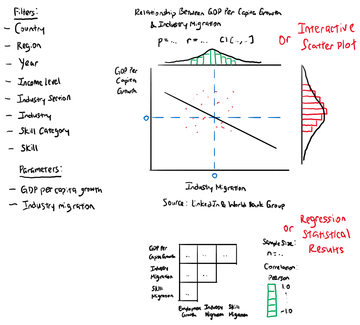
1.6 Advantages and Components of Data Visualisation
For this assignment, the proposed data visualisation is a reactive and interactive dashboard with scatter, regression and correlation plots. It can be filtered according to country, region, year, income level, industry section, industry, skill category and skill to show different plots. Users can choose two parameters and find out the relationship between GDP per capita growth and industry employment growth/industry migration/skill migration, or industry employment growth and industry/skill migration. The scatter plot is interactive, where users can hover over each point to find out the values. Correlation of GDP per capita growth, industry employment growth, industry migration and skill migration will be determined as well.
The following packages are used to build the respective plots or results:
- Scatter Plot (scatterD3)
- Regression Plot with Histograms as Marginal Distributions (ggstatsplot - ggscatterstats)
- Regression Statistical Results (parameters)
- Correlation Plot (ggstatsplot - ggcorrmat)
2.0 Packages and Data Preparation
2.1 Installing and Launching R Packages
First, we will install and launch the relevant R packages.
Unlike R Shiny, we are unable to have a reactive filter on R Markdown that can filter the dataset and directly change the regression and correlation plots. Crosstalk, d3scatter and lazyeval packages allow such filter on R Markdown, but are only compatible with data tables and scatter plots. In this assignment, we will use crosstalk, d3scatter and lazyeval packages to filter and explore the distributions of variables on scatter plots, before we manually adjust the code and filter the dataset, which will change the regression and correlation plots.
As for the scatterD3 package, it allows the scatter plot to be interactive on R Markdown and R Shiny.
If d3scatter and scatterD3 packages have not been installed before, we can run the following commands.
packages = c('devtools')

for(p in packages){
  if(!require(p, character.only = T)){
    install.packages(p)
  }
  library(p, character.only = T)
}
devtools::install_github("jcheng5/d3scatter")
devtools::install_github("juba/scatterD3")
If d3scatter and scatterD3 packages have already been installed, we can run the following command to install and launch all relevant R packages.
In addition to the packages mentioned in Section 1.6, the readxl package is required to read xlsx files and the tidyverse package is needed to import data (read_csv), do data cleaning and manipulation (dplyr, tidyr). The plotly package also allows the regression plot to be interactive i.e. show the value of each point.
packages = c('readxl', 'devtools', 'crosstalk', 'd3scatter',
             'lazyeval', 'scatterD3', 'tidyverse', 'ggstatsplot',
             'plotly', 'parameters')

for(p in packages){
  if(!require(p, character.only = T)){
    install.packages(p)
  }
  library(p, character.only = T)
}
2.2 Load Datasets onto R
Next, we will load the necessary datasets for this assignment, which include GDP per capita, industry employment growth, industry migration, skill migration and industry skills need.
industryEmploymentGrowth <- read_excel("data/public_use-industry-employment-growth.xlsx",
                                       sheet = "Growth from Industry Transition")

industrySkillsNeeds <- read_excel("data/public_use-industry-skills-needs.xlsx",
                                  sheet = "Industry Skills Needs")

industryMigration <- read_excel("data/public_use-talent-migration.xlsx",
                                sheet = "Industry Migration")

skillMigration <- read_excel("data/public_use-talent-migration.xlsx",
                             sheet = "Skill Migration")

gdpPerCapita <- read_csv("data/API_NY.GDP.PCAP.CD_DS2_en_csv_v2_2055804.csv")
2.3 Data Wrangling
After loading the datasets, we will do the necessary data cleaning and manipulation.
The GDP per capita dataset contains GDP per capita for various countries over many years. First, we change the column name from “Country Name” to “country_name” to be consistent with other datasets. We also change the column names e.g. from “2019” to “gpc2019”, as the numerical labelling may result in difficulties in data wrangling. Only relevant columns are kept i.e. country, GDP per capita from 2014 to 2019. Next, to determine the change in GDP per capita year on year for 2015 to 2019, we apply the formulas and keep only relevant columns i.e. country, GDP per capita growth for 2015 to 2019. Lastly, we use pivot_longer to place GDP per capita growth in rows instead of columns. The name of the column storing the original values of the columns is titled “GDP_per_capita_growth” and the name of the column storing the original names of the columns is titled “year”. We also edit to keep only values of the year i.e. from “gpc2019” to “2019”.
names(gdpPerCapita)[1] <- "country_name"

names(gdpPerCapita)[59] <- "gpc2014"
names(gdpPerCapita)[60] <- "gpc2015"
names(gdpPerCapita)[61] <- "gpc2016"
names(gdpPerCapita)[62] <- "gpc2017"
names(gdpPerCapita)[63] <- "gpc2018"
names(gdpPerCapita)[64] <- "gpc2019"

gdpPerCapita <- gdpPerCapita[-c(2:58, 65)]

gdpPerCapita$g2015 <- (gdpPerCapita$gpc2015/gdpPerCapita$gpc2014) - 1
gdpPerCapita$g2016 <- (gdpPerCapita$gpc2016/gdpPerCapita$gpc2015) - 1
gdpPerCapita$g2017 <- (gdpPerCapita$gpc2017/gdpPerCapita$gpc2016) - 1
gdpPerCapita$g2018 <- (gdpPerCapita$gpc2018/gdpPerCapita$gpc2017) - 1
gdpPerCapita$g2019 <- (gdpPerCapita$gpc2019/gdpPerCapita$gpc2018) - 1

gdpPerCapita <- gdpPerCapita[-c(2:7)] %>%
  pivot_longer(cols = c(`g2015`, `g2016`, `g2017`, `g2018`, `g2019`),
               names_to = "year",
               values_to = "GDP_per_capita_growth") %>%
  mutate(year = str_sub(year, 2, -1))
The industry employment growth dataset contains employment growth rate for various industries in various countries from 2015 to 2019. We will keep only relevant columns i.e. country, region, income, industry, employment growth for 2015 to 2019. Next, we use pivot_longer to place industry employment growth in rows instead of columns. The name of the column storing the original values of the columns is titled “employment_growth” and the name of the column storing the original names of the columns is titled “year”. We also edit to keep only values of the year i.e. from “growth_rate_2019” to “2019”.
The industry migration dataset contains migration data for various industries in various countries from 2015 to 2019. We will keep only relevant columns i.e. country, region, income, industry, migration for 2015 to 2019. Next, we use pivot_longer to place industry migration in rows instead of columns. The name of the column storing the original values of the columns is titled “industry_migration” and the name of the column storing the original names of the columns is titled “year”. We also edit to keep only values of the year i.e. from “net_per_10k_2019” to “2019”. Lastly, we will normalise industry migration by dividing by 1000 i.e. industry migration (net per 10) to have a common scale with GDP per capita growth and industry employment growth.
industryMigration <- industryMigration[-c(1, 5, 7)] %>%
  pivot_longer(cols = c(`net_per_10K_2015`, `net_per_10K_2016`, `net_per_10K_2017`,
                        `net_per_10K_2018`, `net_per_10K_2019`),
               names_to = "year",
               values_to = "industry_migration") %>%
  mutate(year = str_sub(year, 13, -1)) %>%
  mutate(industry_migration = industry_migration / 1000)
The skill migration dataset contains migration data for various skills in various countries from 2015 to 2019. We will keep only relevant columns i.e. country, region, income, skill, skill migration for 2015 to 2019. Next, we use pivot_longer to place skill migration in rows instead of columns. The name of the column storing the original values of the columns is titled “skill_migration” and the name of the column storing the original names of the columns is titled “year”. We also edit to keep only values of the year i.e. from “net_per_10k_2019” to “2019”. Lastly, we will normalise skill migration by dividing by 1000 i.e. skill migration (net per 10) to have a common scale with GDP per capita growth and industry employment growth.
skillMigration <- skillMigration[-c(1, 5)] %>%
  pivot_longer(cols = c(`net_per_10K_2015`, `net_per_10K_2016`, `net_per_10K_2017`,
                        `net_per_10K_2018`, `net_per_10K_2019`),
               names_to = "year",
               values_to = "skill_migration") %>%
  mutate(year = str_sub(year, 13, -1)) %>%
  mutate(skill_migration = skill_migration / 1000)
The industry skills need dataset contains the top 10 skill needs for each industry from 2015 to 2019. We will merge skill migration and industry skill need datasets to form the industrySkillMigration data table and show the industries which the skills are needed in.
Various datasets are then merged to have various visualisations of regression and correlation. They are as follows.
- master1: merge GDP per capita and industry employment growth datasets to compare GDP per capita growth with industry employment growth
- master2: merge GDP per capita and industry migration datasets to compare GDP per capita growth with industry migration
- master3: merge GDP per capita and skill migration datasets to compare GDP per capita growth with skill migration
- master4: merge industry employment growth and industry migration datasets to compare industry employment growth and industry migration
- master5: merge industry employment growth and industry skill migration datasets to compare industry employment growth and industry skill migration
- master6: merge master2 and master5 to have a master data table containing values of GDP per capita growth, industry employment growth, industry migration and skill migration
master1 <- merge(industryEmploymentGrowth, gdpPerCapita,
                 by = c("country_name", "year"))
master2 <- merge(industryMigration, gdpPerCapita,
                 by = c("country_name", "year"))
master3 <- merge(skillMigration, gdpPerCapita,
                 by = c("country_name", "year"))
master4 <- merge(industryEmploymentGrowth, industryMigration,
                 by = c("country_name", "year", "wb_region", "wb_income",
                        "isic_section_name", "industry_name"))
master5 <- merge(industryEmploymentGrowth, industrySkillMigration,
                 by = c("country_name", "year", "wb_region", "wb_income",
                        "isic_section_name", "industry_name"))
master6 <- merge(master5, master2,
                 by = c("country_name", "year", "wb_region", "wb_income",
                        "isic_section_name", "industry_name"))
master6 is saved into a csv file, so that it can be easily used for future analysis. row.names is set as false, as it’s not necessary to store the row numbers.
write.csv(master6, "C:\\Distill\\blog\\Assignment\\master.csv", row.names = FALSE)
3.0 Bivariate Data Visualisation and Analysis
3.1 Scatter Plots
For simplicity in this assignment, we will use master6, even though there may be less observations when the data tables are merged.
In this section, we will use crosstalk and d3scatter packages to create scatter plots that can be filtered by country, region, year, income level, industry section, industry, skill category and skill on R Markdown without the use of R Shiny. By default, all options are chosen and multiple options can selected for the filters. They are also coloured by year to show the differences over the years. The limitations are the inability to adjust the orientation of the axes labels and to place the reference lines at zero for aesthetic purpose. Nonetheless, the scatter plots are more for exploratory purpose for this assignment, so we won’t adjust the aesthetics of the scatter plots further. In addition, due to the long processing time and resulting large size of the R Markdown file, we are unable to publish the reactive scatter plots on netfily and can only show it in image format in the web report.
The following scatter plots are plotted:
shared_master <- SharedData$new(master6)
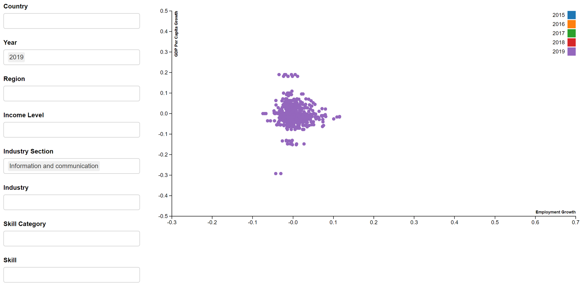
- GDP per capita growth vs Employment growth
bscols(widths = c(3,NA),
       list(
         filter_select("country_name", "Country",
                       shared_master, ~country_name,
                       allLevels = TRUE, multiple = TRUE),
         filter_select("year", "Year",
                       shared_master, ~year,
                       allLevels = TRUE, multiple = TRUE),
         filter_select("wb_region", "Region",
                       shared_master, ~wb_region,
                       allLevels = TRUE, multiple = TRUE),
         filter_select("wb_income", "Income Level",
                       shared_master, ~wb_income,
                       allLevels = TRUE, multiple = TRUE),
         filter_select("isic_section_name", "Industry Section",
                       shared_master, ~isic_section_name,
                       allLevels = TRUE, multiple = TRUE),
         filter_select("industry_name", "Industry",
                       shared_master, ~industry_name,
                       allLevels = TRUE, multiple = TRUE),
         filter_select("skill_group_category", "Skill Category",
                       shared_master, ~skill_group_category,
                       allLevels = TRUE, multiple = TRUE),
         filter_select("skill_group_name", "Skill",
                       shared_master, ~skill_group_name,
                       allLevels = TRUE, multiple = TRUE)
       ),
       d3scatter(shared_master, ~employment_growth, ~GDP_per_capita_growth, ~year,
                 x_label = "Employment Growth",
                 y_label = "GDP Per Capita Growth",
                 width = "100%", height = 500)
)
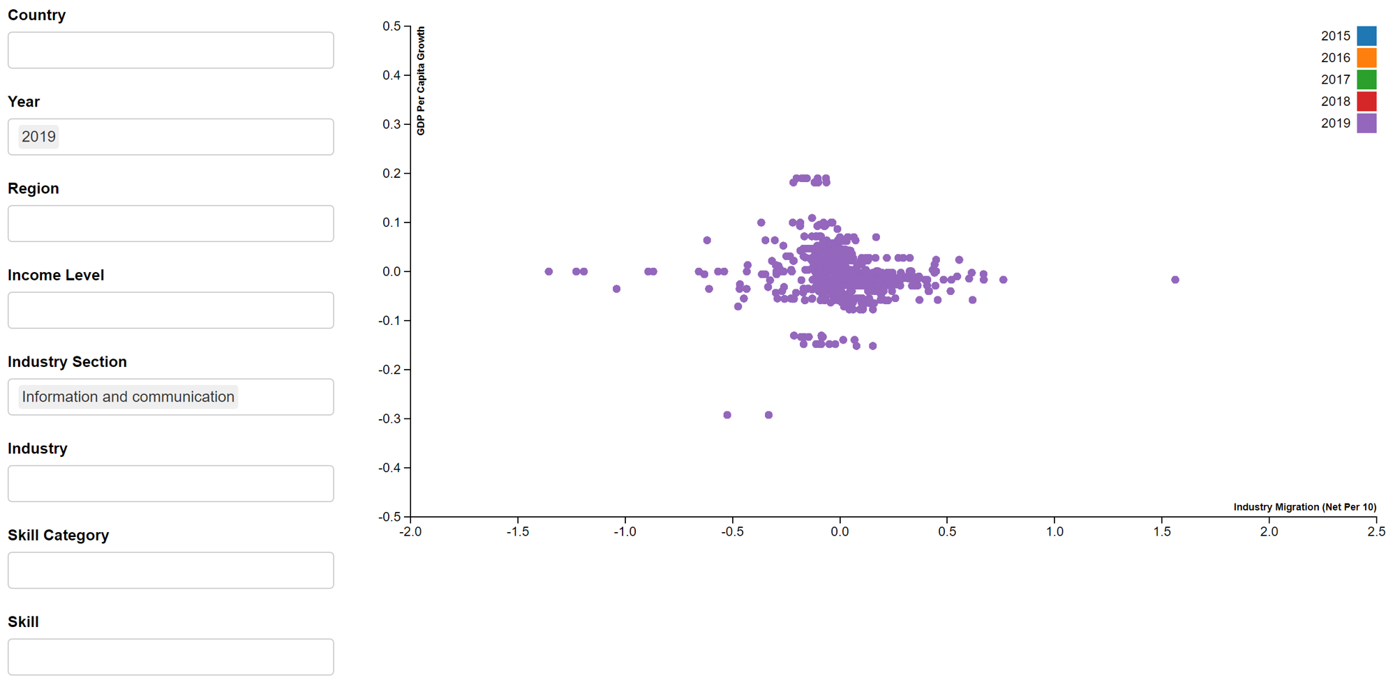
- GDP per capita growth vs Industry migration
bscols(widths = c(3,NA),
       list(
         filter_select("country_name", "Country",
                       shared_master, ~country_name,
                       allLevels = TRUE, multiple = TRUE),
         filter_select("year", "Year",
                       shared_master, ~year,
                       allLevels = TRUE, multiple = TRUE),
         filter_select("wb_region", "Region",
                       shared_master, ~wb_region,
                       allLevels = TRUE, multiple = TRUE),
         filter_select("wb_income", "Income Level",
                       shared_master, ~wb_income,
                       allLevels = TRUE, multiple = TRUE),
         filter_select("isic_section_name", "Industry Section",
                       shared_master, ~isic_section_name,
                       allLevels = TRUE, multiple = TRUE),
         filter_select("industry_name", "Industry",
                       shared_master, ~industry_name,
                       allLevels = TRUE, multiple = TRUE),
         filter_select("skill_group_category", "Skill Category",
                       shared_master, ~skill_group_category,
                       allLevels = TRUE, multiple = TRUE),
         filter_select("skill_group_name", "Skill",
                       shared_master, ~skill_group_name,
                       allLevels = TRUE, multiple = TRUE)
       ),
       d3scatter(shared_master, ~industry_migration, ~GDP_per_capita_growth, ~year,
                 x_label = "Industry Migration (Net Per 10)",
                 y_label = "GDP Per Capita Growth",
                 width = "100%", height = 500)
)
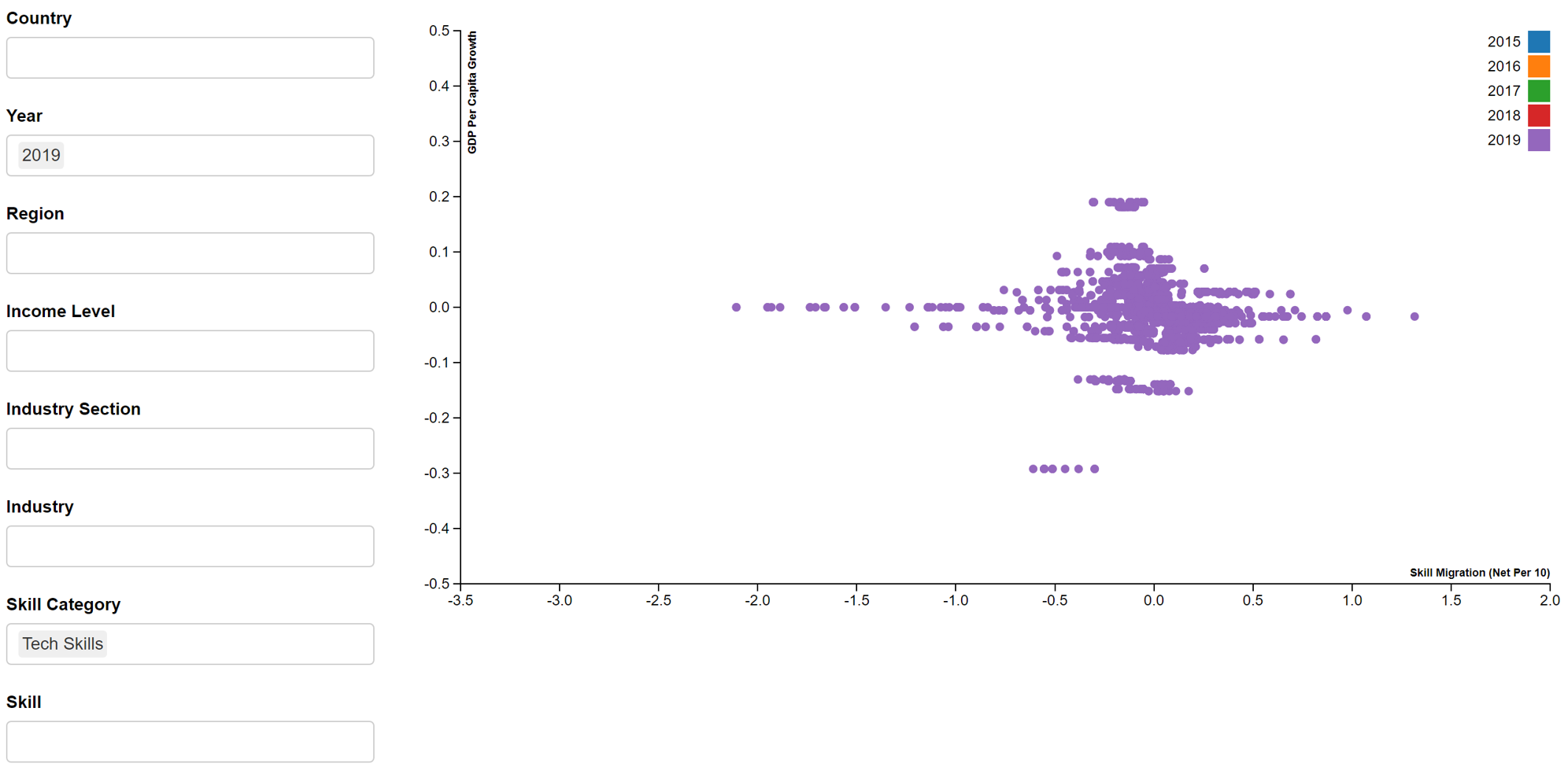
- GDP per capita growth vs Skill migration
bscols(widths = c(3,NA),
       list(
         filter_select("country_name", "Country",
                       shared_master, ~country_name,
                       allLevels = TRUE, multiple = TRUE),
         filter_select("year", "Year",
                       shared_master, ~year,
                       allLevels = TRUE, multiple = TRUE),
         filter_select("wb_region", "Region",
                       shared_master, ~wb_region,
                       allLevels = TRUE, multiple = TRUE),
         filter_select("wb_income", "Income Level",
                       shared_master, ~wb_income,
                       allLevels = TRUE, multiple = TRUE),
         filter_select("isic_section_name", "Industry Section",
                       shared_master, ~isic_section_name,
                       allLevels = TRUE, multiple = TRUE),
         filter_select("industry_name", "Industry",
                       shared_master, ~industry_name,
                       allLevels = TRUE, multiple = TRUE),
         filter_select("skill_group_category", "Skill Category",
                       shared_master, ~skill_group_category,
                       allLevels = TRUE, multiple = TRUE),
         filter_select("skill_group_name", "Skill",
                       shared_master, ~skill_group_name,
                       allLevels = TRUE, multiple = TRUE)
       ),
       d3scatter(shared_master, ~skill_migration, ~GDP_per_capita_growth, ~year,
                 x_label = "Skill Migration (Net Per 10)",
                 y_label = "GDP Per Capita Growth",
                 width = "100%", height = 500)
)
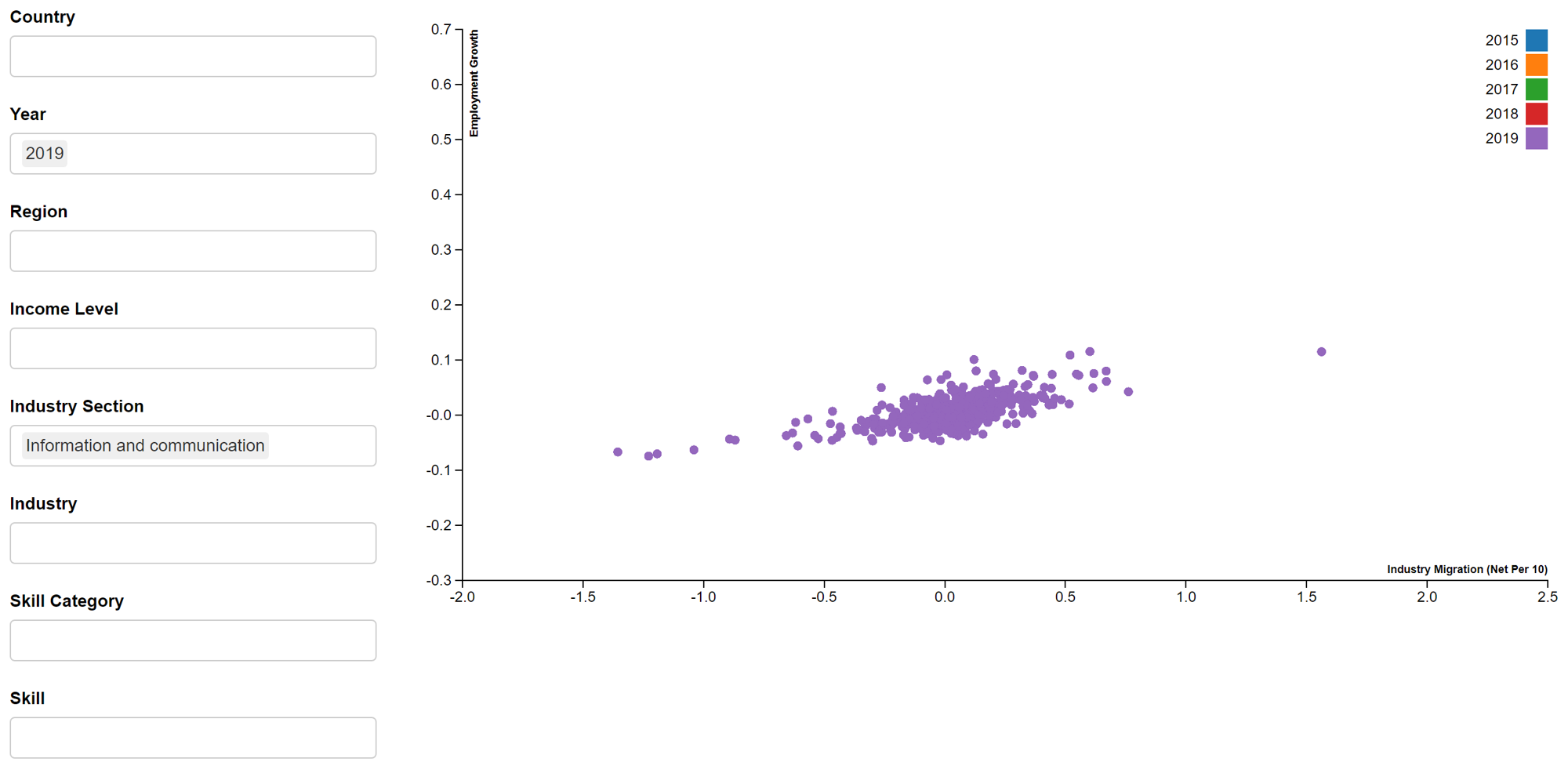
- Employment growth vs Industry migration
bscols(widths = c(3,NA),
       list(
         filter_select("country_name", "Country",
                       shared_master, ~country_name,
                       allLevels = TRUE, multiple = TRUE),
         filter_select("year", "Year",
                       shared_master, ~year,
                       allLevels = TRUE, multiple = TRUE),
         filter_select("wb_region", "Region",
                       shared_master, ~wb_region,
                       allLevels = TRUE, multiple = TRUE),
         filter_select("wb_income", "Income Level",
                       shared_master, ~wb_income,
                       allLevels = TRUE, multiple = TRUE),
         filter_select("isic_section_name", "Industry Section",
                       shared_master, ~isic_section_name,
                       allLevels = TRUE, multiple = TRUE),
         filter_select("industry_name", "Industry",
                       shared_master, ~industry_name,
                       allLevels = TRUE, multiple = TRUE),
         filter_select("skill_group_category", "Skill Category",
                       shared_master, ~skill_group_category,
                       allLevels = TRUE, multiple = TRUE),
         filter_select("skill_group_name", "Skill",
                       shared_master, ~skill_group_name,
                       allLevels = TRUE, multiple = TRUE)
       ),
       d3scatter(shared_master, ~industry_migration, ~employment_growth, ~year,
                 x_label = "Industry Migration (Net Per 10)",
                 y_label = "Employment Growth",
                 width = "100%", height = 500)
)
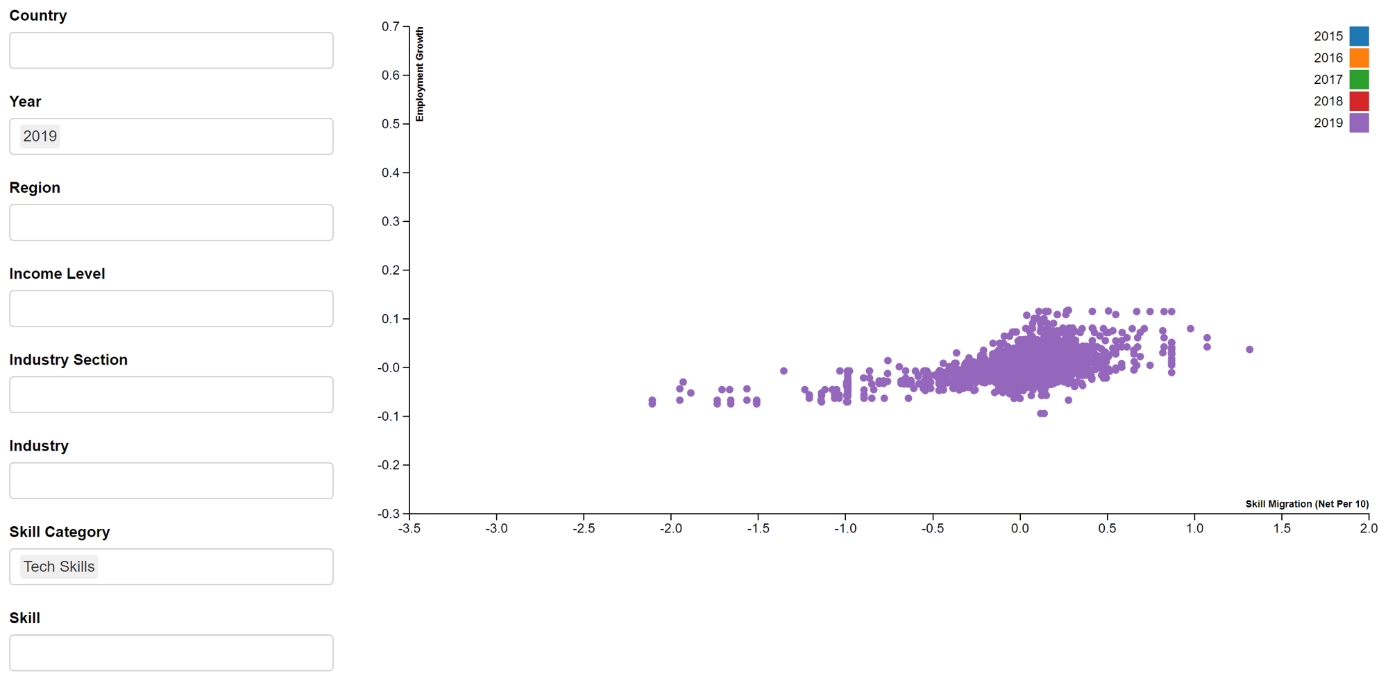
- Employment growth vs Skill migration
bscols(widths = c(3,NA),
       list(
         filter_select("country_name", "Country",
                       shared_master, ~country_name,
                       allLevels = TRUE, multiple = TRUE),
         filter_select("year", "Year",
                       shared_master, ~year,
                       allLevels = TRUE, multiple = TRUE),
         filter_select("wb_region", "Region",
                       shared_master, ~wb_region,
                       allLevels = TRUE, multiple = TRUE),
         filter_select("wb_income", "Income Level",
                       shared_master, ~wb_income,
                       allLevels = TRUE, multiple = TRUE),
         filter_select("isic_section_name", "Industry Section",
                       shared_master, ~isic_section_name,
                       allLevels = TRUE, multiple = TRUE),
         filter_select("industry_name", "Industry",
                       shared_master, ~industry_name,
                       allLevels = TRUE, multiple = TRUE),
         filter_select("skill_group_category", "Skill Category",
                       shared_master, ~skill_group_category,
                       allLevels = TRUE, multiple = TRUE),
         filter_select("skill_group_name", "Skill",
                       shared_master, ~skill_group_name,
                       allLevels = TRUE, multiple = TRUE)
       ),
       d3scatter(shared_master, ~skill_migration, ~employment_growth, ~year,
                 x_label = "Skill Migration (Net Per 10)",
                 y_label = "Employment Growth",
                 width = "100%", height = 500)
)
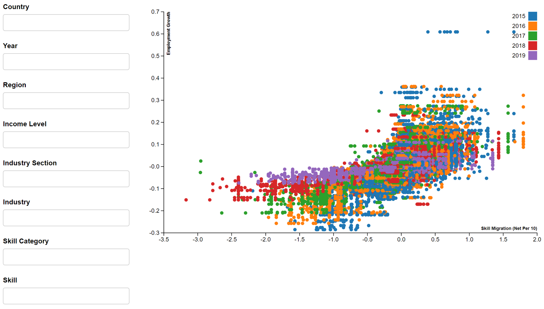
In this assignment, we will focus on 2019 dataset for information and communication industry or tech skills, given the relevance to SMU MITB students. By applying the filters i.e. year (2019), industry section (information and communication) and skill category (tech skills), the above reactive scatter plots will produce Figures 4-8.
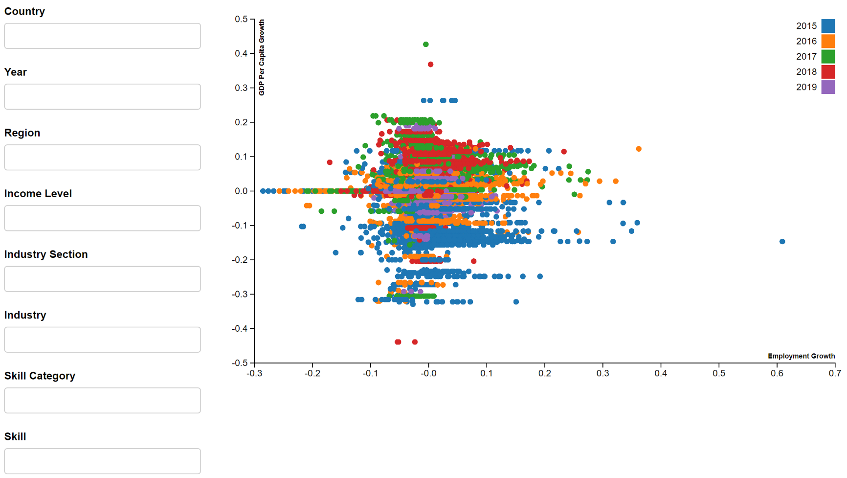
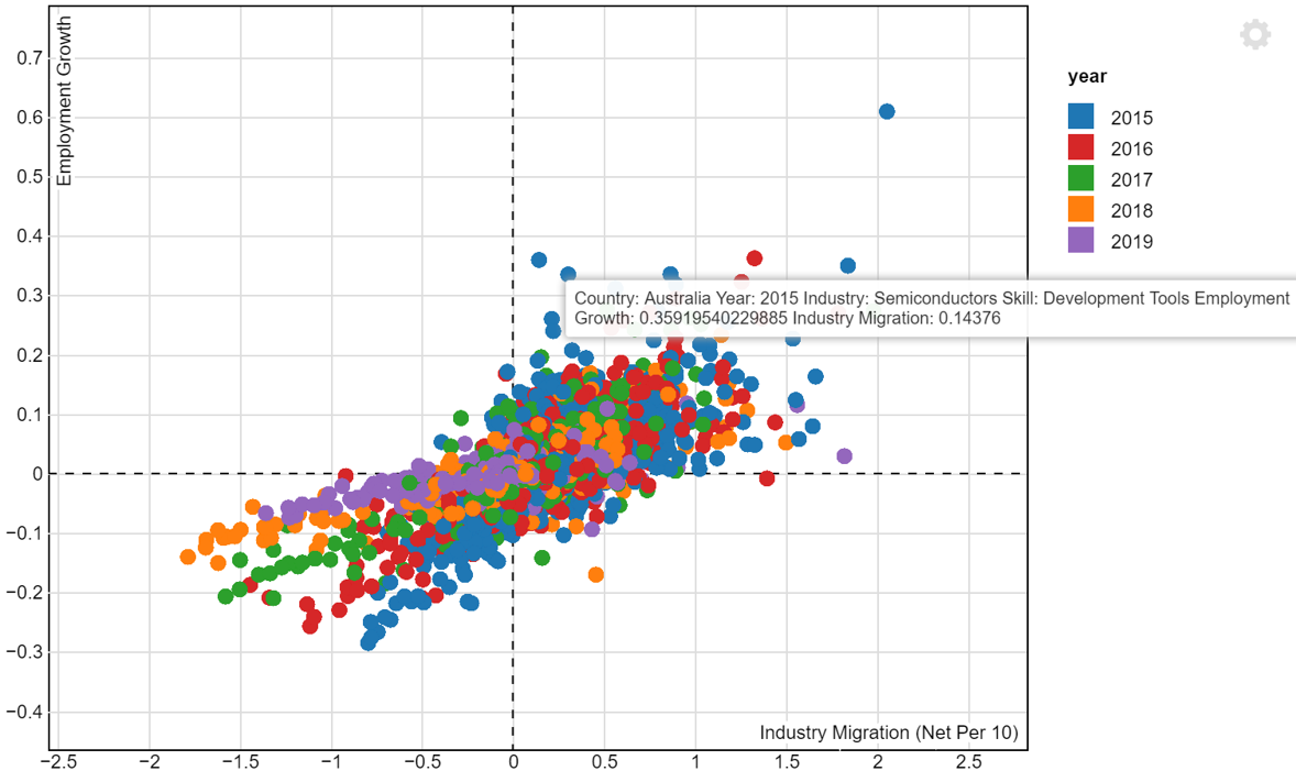
In addition, we will create an interactive scatter plot that will be displayed in the R Shiny App. The scatterD3 package will be used. An example of the employment growth vs industry migration interactive scatter plot is seen in Figure 9. Due to the long processing time and resulting large size of the R Markdown file, we are unable to publish this interactive scatter plot on netfily and can only show it in image format. The plot is coloured by year and will show the country, year, industry, skill and values of variables under the tooltip.
tooltips <- paste("Country: ", master6$country_name,
                  "Year: ", master6$year,
                  "Industry: ", master6$industry_name,
                  "Skill: ", master6$skill_group_name,
                  "Employment Growth: ", master6$employment_growth,
                  "Industry Migration: ", master6$industry_migration)

scatterD3(data = master6,
          x = industry_migration, y = employment_growth,
          xlab = "Industry Migration (Net Per 10)",
          ylab = "Employment Growth",
          col_var = year,
          tooltip_text = tooltips)
3.2 Filtered Datasets
Next, we will edit the code to filter master6. Two filtered data tables are created, one filtered by year 2019 and information and communication industry and the other filtered by year 2019 and tech skills. These will be used to find specific results under the regression and correlation plots. With the results, countries can find out how GDP per capita growth is impacted by changes in employment and migration for information and communication industry and tech skill. Users can also find out the relationship between employment growth and migration for information and communication industry and tech skill to find potential job opportunities.
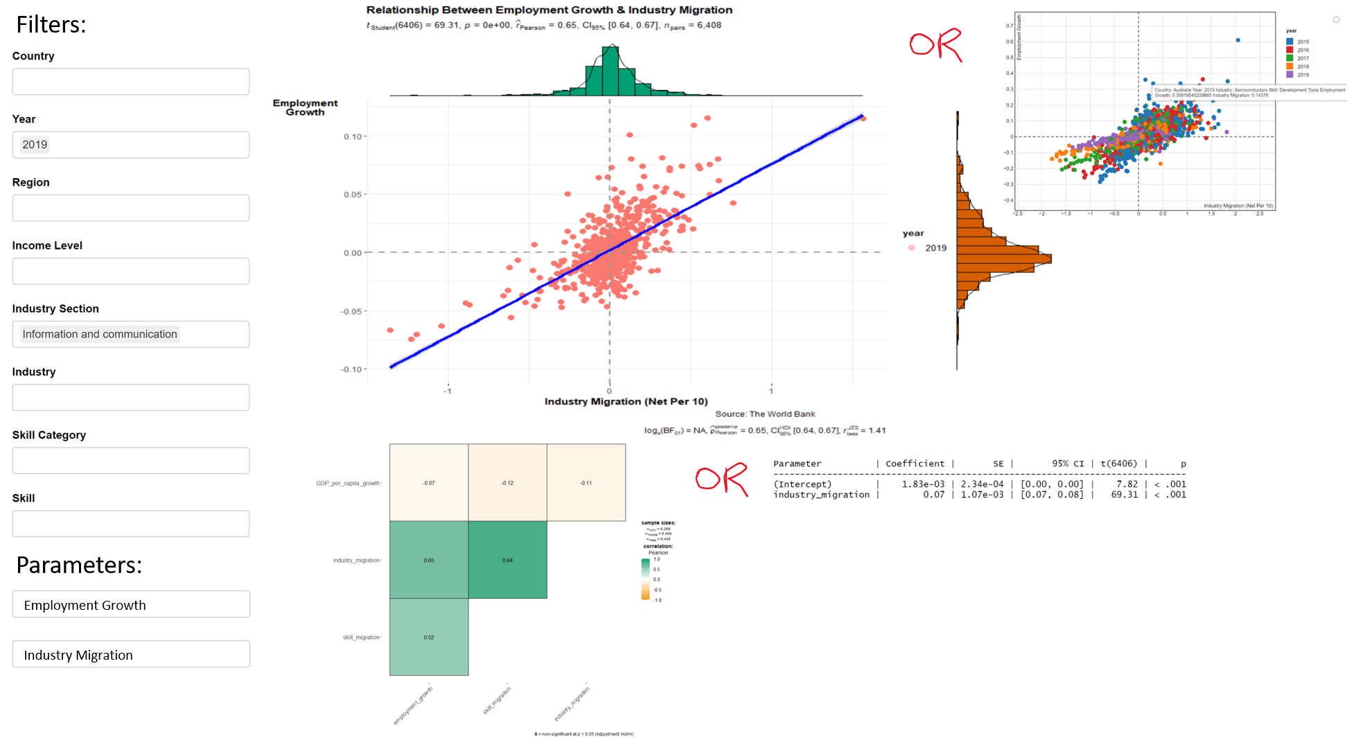
3.3 Regression Plots
Using the filtered data tables, we will create the respective regression plots as seen below. ggstatsplot package is used instead of ggplot package, as it provides the statistical results, allows histograms to be plotted (marginal distributions) and we can analyse the distributions of both variables in the regression plots. We had intended to make the regression plots interactive. However, the plotly package is not compatible with ggstatsplot (ggscatterstats). Thus, we decided to prioritise showing the statistical results using ggstatsplot (ggscatterstats). The regression plots will not be interactive but will be reactive to respond to the filters and chosen parameters.
For the regression plots, the title, axes (xlab, ylab) and source (caption) are labelled appropriately. The y axis label is rotated to improve readability. The plots are coloured by year. Note that since the filtered data tables contain data only from year 2019, there will only be one colour seen here. Reference lines are drawn at zero to allow users to distinguish between positive and negative easily. The default 95% confidence interval is used and the results of the statistical tests are displayed. From the plots, we note that the distributions of all the variables follow a normal distribution. We will further discuss the results in the later section.
In addition, we will use the parameters package to show the results of each regression model. The package streamlines the reporting and provides an easy and intuitive calculation of standardized estimates or robust standard errors and p-values. It also implements parameter reduction and enables us to identify key variables for the regression model.
- GDP per capita growth vs Employment growth
ggscatterstats(filtered_master1, employment_growth, GDP_per_capita_growth,
               title = "Relationship Between GDP Per Capita Growth & Employment Growth",
               caption = "Source: LinkedIn & World Bank Group",
               ggplot.component = list(ggplot2::
                        aes(employment_growth, GDP_per_capita_growth,
                            colour = year),
                        xlab("Employment Growth"),
                        ylab("GDP Per\nCapita\nGrowth"),
                        theme(axis.title.y = element_text(angle = 0)),
                        geom_hline(yintercept = 0,
                                   linetype = "dashed",
                                   color = "grey60",
                                   size = 1),
                        geom_vline(xintercept = 0,
                                   linetype = "dashed",
                                   color = "grey60",
                                   size = 1)))

lm(GDP_per_capita_growth ~ employment_growth, filtered_master1) %>%
  model_parameters()
Parameter         | Coefficient |       SE |         95% CI | t(6267) |      p
------------------------------------------------------------------------------
(Intercept)       |   -4.20e-03 | 6.61e-04 | [-0.01,  0.00] |   -6.35 | < .001
employment_growth | -0.14 | 0.03 | [-0.20, -0.09] | -5.29 | < .001- GDP per capita growth vs Industry migration
ggscatterstats(filtered_master1, industry_migration, GDP_per_capita_growth,
               title = "Relationship Between GDP Per Capita Growth & Industry Migration",
               caption = "Source: LinkedIn & World Bank Group",
               ggplot.component = list(ggplot2::
                        aes(industry_migration, GDP_per_capita_growth,
                            colour = year),
                        xlab("Industry Migration (Net Per 10)"),
                        ylab("GDP Per\nCapita\nGrowth"),
                        theme(axis.title.y = element_text(angle = 0)),
                        geom_hline(yintercept = 0,
                                   linetype = "dashed",
                                   color = "grey60",
                                   size = 1),
                        geom_vline(xintercept = 0,
                                   linetype = "dashed",
                                   color = "grey60",
                                   size = 1)))

lm(GDP_per_capita_growth ~ industry_migration, filtered_master1) %>%
  model_parameters()
Parameter          | Coefficient |       SE |         95% CI | t(6267) |      p
-------------------------------------------------------------------------------
(Intercept)        |   -3.98e-03 | 6.57e-04 | [-0.01,  0.00] |   -6.05 | < .001
industry_migration | -0.03 | 3.45e-03 | [-0.04, -0.02] | -8.56 | < .001- GDP per capita growth vs Skill migration
ggscatterstats(filtered_master2, skill_migration, GDP_per_capita_growth,
               title = "Relationship Between GDP Per Capita Growth & Skill Migration",
               caption = "Source: LinkedIn & World Bank Group",
               ggplot.component = list(ggplot2::
                        aes(skill_migration, GDP_per_capita_growth,
                            colour = year),
                        xlab("Skill Migration (Net Per 10)"),
                        ylab("GDP Per\nCapita\nGrowth"),
                        theme(axis.title.y = element_text(angle = 0)),
                        geom_hline(yintercept = 0,
                                   linetype = "dashed",
                                   color = "grey60",
                                   size = 1),
                        geom_vline(xintercept = 0,
                                   linetype = "dashed",
                                   color = "grey60",
                                   size = 1)))

lm(GDP_per_capita_growth ~ skill_migration, filtered_master1) %>%
  model_parameters()
Parameter       | Coefficient |       SE |         95% CI | t(6267) |      p
----------------------------------------------------------------------------
(Intercept)     |   -4.15e-03 | 6.54e-04 | [-0.01,  0.00] |   -6.34 | < .001
skill_migration | -0.03 | 3.40e-03 | [-0.04, -0.02] | -9.19 | < .001- Employment growth vs Industry migration
ggscatterstats(filtered_master1, industry_migration, employment_growth,
               title = "Relationship Between Employment Growth & Industry Migration",
               caption = "Source: LinkedIn & World Bank Group",
               ggplot.component = list(ggplot2::
                        aes(industry_migration, employment_growth,
                            colour = year),
                        xlab("Industry Migration (Net Per 10)"),
                        ylab("Employment\nGrowth"),
                        theme(axis.title.y = element_text(angle = 0)),
                        geom_hline(yintercept = 0,
                                   linetype = "dashed",
                                   color = "grey60",
                                   size = 1),
                        geom_vline(xintercept = 0,
                                   linetype = "dashed",
                                   color = "grey60",
                                   size = 1)))

lm(employment_growth ~ industry_migration, filtered_master1) %>%
  model_parameters()
Parameter          | Coefficient |       SE |       95% CI | t(6406) |      p
-----------------------------------------------------------------------------
(Intercept)        |    1.83e-03 | 2.34e-04 | [0.00, 0.00] |    7.82 | < .001
industry_migration | 0.07 | 1.07e-03 | [0.07, 0.08] | 69.31 | < .001- Employment growth vs Skill migration
ggscatterstats(filtered_master2, skill_migration, employment_growth,
               title = "Relationship Between Employment Growth & Skill Migration",
               caption = "Source: LinkedIn & World Bank Group",
               ggplot.component = list(ggplot2::
                        aes(skill_migration, employment_growth,
                            colour = year),
                        xlab("Skill Migration (Net Per 10)"),
                        ylab("Employment\nGrowth"),
                        theme(axis.title.y = element_text(angle = 0)),
                        geom_hline(yintercept = 0,
                                   linetype = "dashed",
                                   color = "grey60",
                                   size = 1),
                        geom_vline(xintercept = 0,
                                   linetype = "dashed",
                                   color = "grey60",
                                   size = 1)))

lm(employment_growth ~ skill_migration, filtered_master1) %>%
  model_parameters()
Parameter       | Coefficient |       SE |       95% CI | t(6406) |      p
--------------------------------------------------------------------------
(Intercept)     |    2.68e-03 | 2.63e-04 | [0.00, 0.00] |   10.18 | < .001
skill_migration |        0.05 | 1.07e-03 | [0.05, 0.05] |   49.11 | < .001
3.4 Correlation Plots
Next, we will find out the correlation of the variables. Given that there are very few variables (only 4), we will use ggcorrmat (under ggstatsplot package) instead of corrplot and other packages, as it will produce a simple correlation plot. We will use the default properties i.e. upper triangular matrix and significance level of 0.05. Both filtered data tables are used for the correlation plots.
It is noted that GDP per capita growth is weakly correlated with employment growth, industry and skill migration. Industry and skill migration are highly correlated (>0.8) for both plots. The results will be further discussed in the later section.
ggcorrmat(filtered_master1,
          cor.vars = c(7, 10, 11, 12))

ggcorrmat(filtered_master2,
          cor.vars = c(7, 10, 11, 12))

3.5 Multiple Regression
In addition to the simple regression plots, we will build a multiple regression model in this assignment using the parameters package to study the relationship between GDP per capita growth and multiple variables i.e. employment growth, industry and skill migration.
The regression model shows weak relationship (low R-squared values) between GDP per capita growth and the dependent variables. Hence, it is not useful and we opt not to show it for the final data visualisation on the dashboard.
lm(GDP_per_capita_growth ~ employment_growth
   + industry_migration + skill_migration,
   filtered_master1) %>%
  summary()
Call:
lm(formula = GDP_per_capita_growth ~ employment_growth + industry_migration +
    skill_migration, data = filtered_master1)

Residuals:
      Min        1Q    Median        3Q       Max
-0.309330 -0.021722 -0.003649  0.028596  0.192260

Coefficients:
                     Estimate Std. Error t value Pr(>|t|)
(Intercept)        -0.0040245  0.0006589  -6.108 1.07e-09 ***
employment_growth   0.0004486  0.0348529   0.013   0.9897
industry_migration -0.0118106  0.0064041  -1.844   0.0652 .
skill_migration    -0.0220432  0.0056355  -3.911 9.27e-05 ***
---
Signif. codes:  0 '***' 0.001 '**' 0.01 '*' 0.05 '.' 0.1 ' ' 1

Residual standard error: 0.05157 on 6265 degrees of freedom
  (139 observations deleted due to missingness)
Multiple R-squared:  0.01398,   Adjusted R-squared:  0.01351
F-statistic: 29.61 on 3 and 6265 DF,  p-value: < 2.2e-16
3.6 Parameter Selection
We also carried out parameter selection to remove variable(s) that is not important to the regression model, based on the p value. The parameters package (select_parameters) is used.
lm(GDP_per_capita_growth ~ employment_growth
   + industry_migration + skill_migration,
   filtered_master1) %>%
  select_parameters() %>%
  summary()
Call:
lm(formula = GDP_per_capita_growth ~ industry_migration + skill_migration,
    data = filtered_master1)

Residuals:
      Min        1Q    Median        3Q       Max
-0.309333 -0.021722 -0.003659  0.028594  0.192246

Coefficients:
                     Estimate Std. Error t value Pr(>|t|)
(Intercept)        -0.0040238  0.0006568  -6.126 9.54e-10 ***
industry_migration -0.0117732  0.0057089  -2.062   0.0392 *
skill_migration    -0.0220449  0.0056335  -3.913 9.21e-05 ***
---
Signif. codes:  0 '***' 0.001 '**' 0.01 '*' 0.05 '.' 0.1 ' ' 1

Residual standard error: 0.05157 on 6266 degrees of freedom
  (139 observations deleted due to missingness)
Multiple R-squared:  0.01398,   Adjusted R-squared:  0.01366
F-statistic: 44.42 on 2 and 6266 DF,  p-value: < 2.2e-16
As seen in the result, employment growth is removed. We will build a regression model without employment growth to explore the results. However, the regression model still shows a weak relationship (low R-squared values) between GDP per capita growth and the dependent variables. Hence, they are not useful and we opt not to use it for the final data visualisation on the dashboard.
4.0 Proposed Data Visualisation in Dashboard
4.1 Packages Used for R Shiny App
Finally, we will combine the reactive filters, interactive scatter plot, regression plot, regression results and correlation plot on R Shiny app to produce an interactive, reactive, user-friendly dashboard. We can have a button to show either the interactive scatter plot or regression plot and regression results or correlation plot. Figure 10 shows the proposed data visualisation in the dashboard.
In summary, the scatterD3 (interactive scatter plot), ggstatsplot (regression plot, correlation plot) and parameters (regression results) packages will be used to create the proposed R Shiny app. These will be the outputs and they will respond to the input i.e. whether the user chooses to view the interactive scatter plot or regression plot and the correlation plot or regression results, which parameters (GDP per capita, employment growth, industry migration, skill migration) the user chooses to show (selectInput under ui) and how the users choose to filter the data (checkboxInput under ui).
4.2 Discussion of Results
Finally, we discuss the results for the filtered dataset, which is for year 2019, information and communication industry and tech skills.
- The relationship between GDP per capita growth vs industry employment growth, industry migration or skill migration is not strong. This is shown in the low R-squared values (below 0.02) in Section 3.3. Even when multiple variables are used to build a multiple regression model with GDP per capita growth and the less important variables (by p-value) as well as the correlated variables are removed in Section 3.5-3.6, the R-squared values are still low. Furthermore, in Section 3.4, we can see the weak correlation between GDP per capita growth and the other variables. Hence, even though we observe a slight negative relationship between GDP per capita growth and the other variables in Section 3.3 i.e. lower GDP per capita growth with higher employment growth and migration, we are unable to provide a firm conclusion on how GDP per capita growth is impacted by migration and employment growth in a country. Further study can be done to understand how GDP per capita growth is influenced by a combination of many other variables or how different filters used (e.g. year, industry) can change the results.
- The relationship between industry employment growth vs industry or skill migration is stronger, as seen in the R-squared values in Section 3.3 i.e. 0.429 (industry employment growth vs industry migration) and 0.248 (industry employment growth vs skill migration). There is also moderate correlation between industry employment growth vs industry or skill migration, as seen in Section 3.4 i.e. ~0.6 (industry employment growth vs industry migration) and ~0.5 (industry employment growth vs skill migration). Even though the R-squared and correlation results are still not ideal, the results are able to give a glimpse of how much employment growth changes with industry or skill migration. Ideally, the employment growth to industry or skill migration ratio should be positive (i.e. higher employment growth with higher migration, as seen in Section 3.3) and high value to give job seekers confidence that they are more likely to find a job in certain industry and country if they have certain skill. Further study can be done to compare the ratio for different industries and skills. This will give job seekers knowledge of which industries and skills to focus on.