1.0 Critiques and Improvements of Data Visualisation
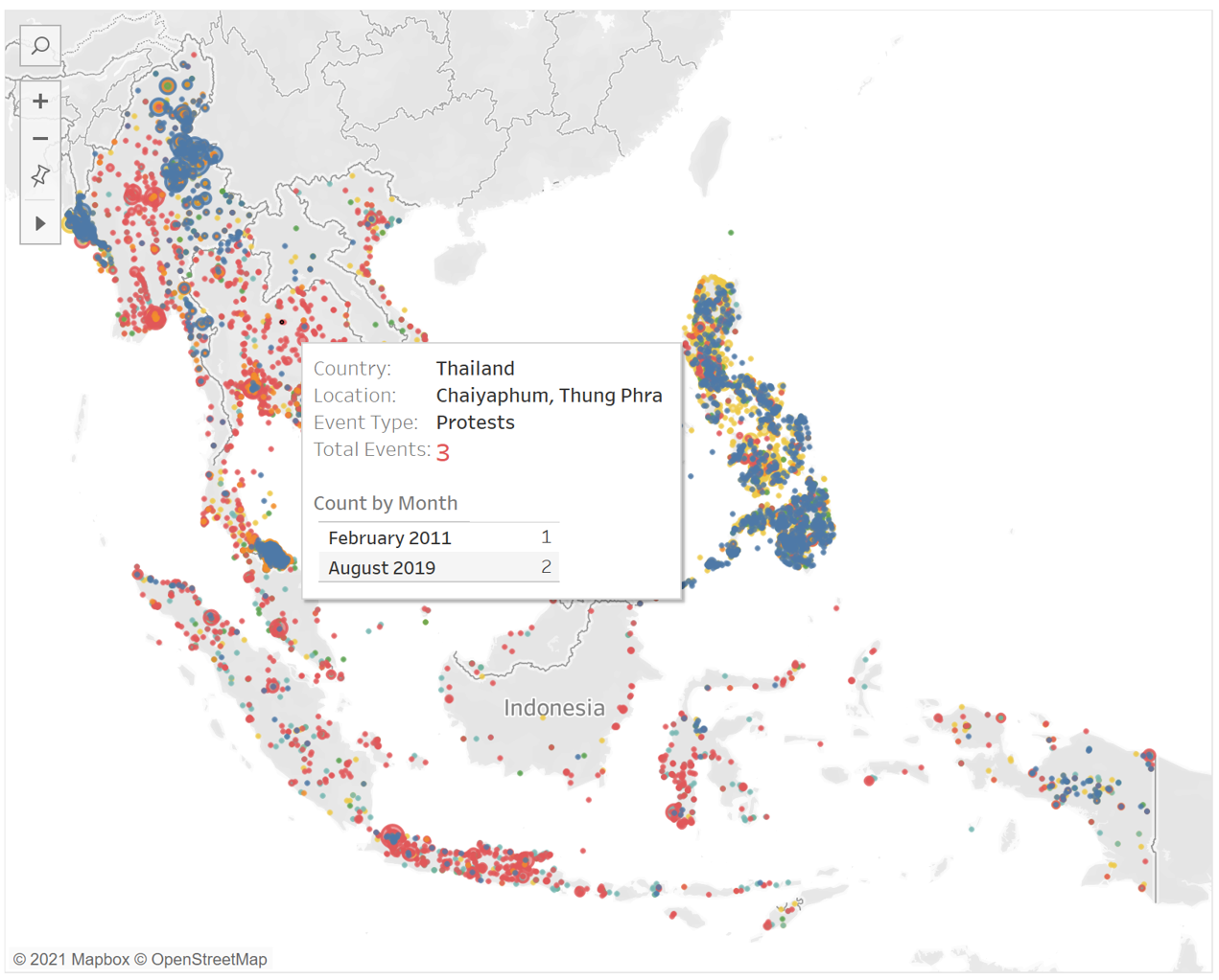
The South-east Asia Armed Conflict Analysis is a data visualisation created to reveal the spatio-temporal patterns of armed conflict in selected South-east Asia countries between 2015-2020 (see Figure 1). The dataset is collected by trained data experts worldwide and can be downloaded at The Armed Conflict Location & Event Data Project (ACLED). The dataset contains the location, date, type, actor(s) and number of fatalities of a political violence, demonstration or select non-violent, politically important event from 2010 to 2020, as well as the source that reported the event and additional note. Full details of the dataset can be found in the Codebook.
Clarity
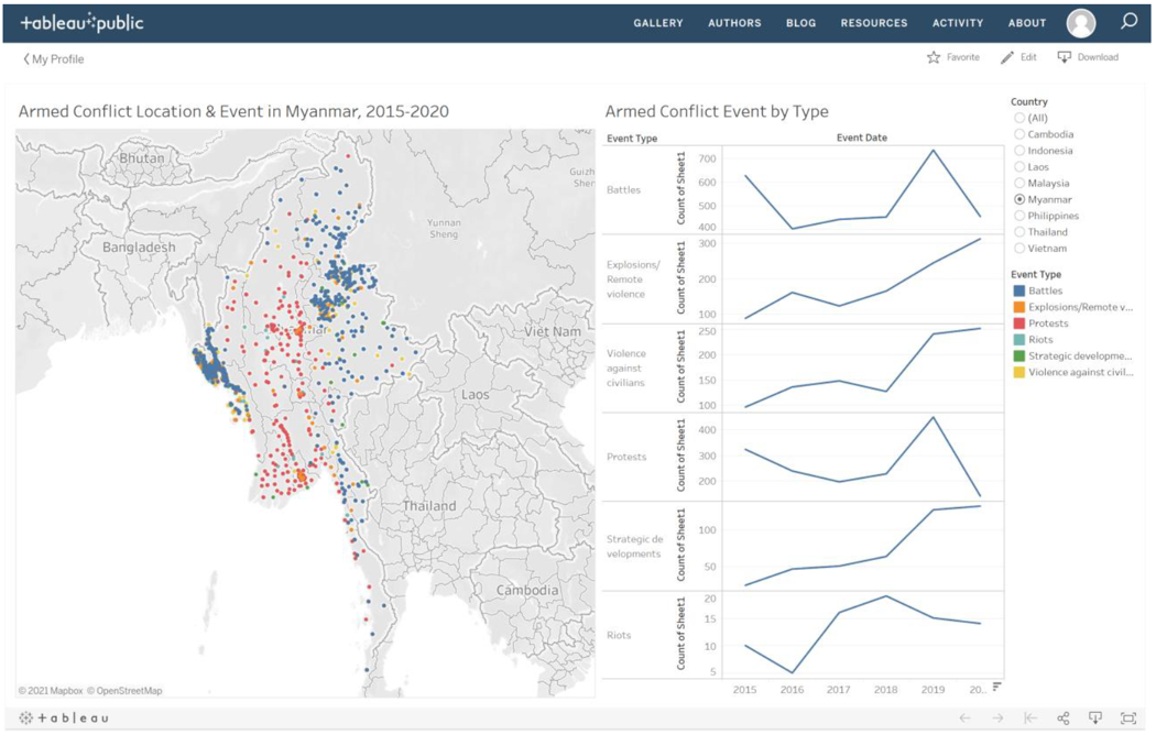
- [C.1] The data visualisation is titled “Armed Conflict Location & Event in Myanmar, 2015-2020” and “Armed Conflict Event by Type”. However, this does not accurately represent the dataset, as there are more event types beyond just armed conflicts e.g. demonstrations, select non-violent, politically important events.
- [C.2] Each location (or dot/symbol) is coloured according to the event type. However, the number of events and fatalities at each location are not shown. As such, readers are not able to compare and understand the extent and severity of events at each location.
- [C.3] While readers can compare the number of events by event type in each year with the graphs, they are unable to compare the number of fatalities by event type in each year, number of events by actor type in each year and number of fatalities by actor type in each year. As such, they are not able to fully understand the breakdown of events and fatalities by event and actor type.
- [C.4] There is no lead-in paragraph in the data visualisation. As such, readers cannot pick out the overall summary and key figures of the data visualisation. For example, the total number of events and fatalities can be indicated for the chosen event type, location, date and actor type e.g. “10 Events and 50 Fatalities for Battles, Riots in Myanmar in 2017-2020 by State Forces”.
- [C.5] The map in the data visualisation cannot be used by readers to easily total up and compare the number of events and fatalities across countries. As such, they are unable to compare the extent and severity of events across countries.
- [C.6] The data source is not cited in the data visualisation. This is not ideal, as readers will not be able to find out more about the background and details of the data source.
Aesthetics
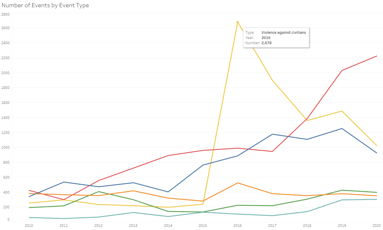
- [A.1] The axes of graphs used to illustrate the number of events by event type in each year are not synchronised. This may give readers a wrong visual perception when they compare the number of events for each event type. For example, a quick glance may cause readers to think that the number of riots is more than battles in Myanmar in 2020.
- [A.2] It is redundant and not aesthetically pleasing to have “Count of Sheet1” in the row labels and tooltip of the graphs, as readers may be confused by its meaning.
- [A.3] The map has overlapping dots/symbols, which do not have borders. Furthermore, there may be multiple event types occurring at a location. This makes it hard for readers to differentiate each point and find out the different types of events that occur at a location.
- [A.4] The lines of the graphs are not coloured by event type, so it’s harder for readers to do a visual comparison between the line graphs and the map.
- [A.5] There is an attempt to sort the graphs by number of events. However, it’s unclear whether it’s sorted by number of events in 2020 or total number of events in 2015-2020.
- [A.6] The Event Id Cnty, Latitude and Longitude are shown in the tooltip of the map. These may not be meaningful information for readers.
Interactivity
- [I.1] Readers can only filter based on the country and cannot filter by event type, date, actor type. This limits the analysis that readers can carry out when using the dashboard.
- [I.2] Readers are unable to use the dashboard to find out further details of each location e.g. number of events or fatalities by event or actor type. As such, readers are not able to compare and understand the extent and severity of events at each location.
- [I.3] The data visualisation is not animated, so readers are unable to understand the change in event type, number of events and fatalities as different filters are applied.
Sketch of Proposed Design
Figure 2 shows the sketch of the proposed data visualisation to replace the original. It will address the critiques which were mentioned earlier.
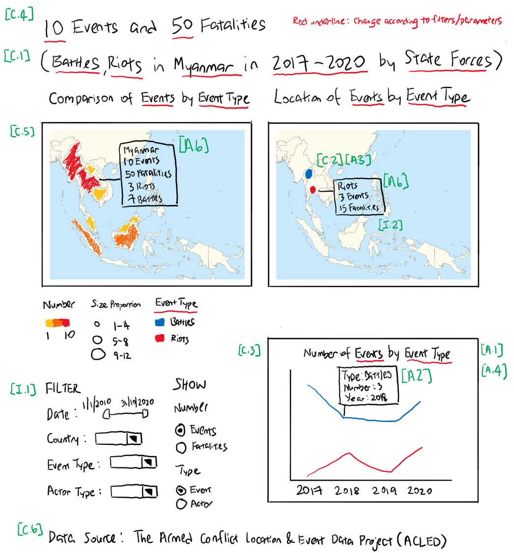
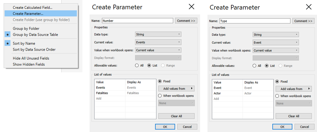
- [C.1, C.4] Parameters are created to allow readers to choose to show the Number of Events or Fatalities and Event or Actor Type. The titles and lead-in paragraph will change according to what the readers choose under the filters (Event Date, Country, Event Type, Actor Type) and parameters. This will accurately reflect the dataset used for the data visualisation and give readers a summary of the key figures.
- [C.2, I.2] The number of events or fatalities, depending what parameters readers choose, will determine the colour shade and size of dots/symbols of the maps. This allows readers to have a quick comparison of the extent and severity of events at different locations. Readers can also look at the number of events or fatalities by event or actor type in each location under Tooltip.
- [C.3] Readers can choose whether to show the number of events or fatalities and the event or actor type in the data visualisation (maps and line graph). This allows readers to understand deeper the breakdown of events and fatalities by event and actor type.
- [C.5] An additional Choropleth Map is proposed to allow comparison of number of events or fatalities across countries by colour shade. Only 8 Southeast Asia countries are to be shown in the map, hence an unclassified Choropleth Map is proposed to allow readers to compare between any two countries. Readers can also look at the number of events, number of fatalities and event types in each country under Tooltip.
- [C.6] The data source will be labelled at the bottom of the data visualisation or dashboard.
- [A.1] Instead of having different graphs and unsynchronised axes for each event type, a single graph with one common axis is proposed. This allows accurate comparison of the number of events or fatalities by event or actor type.
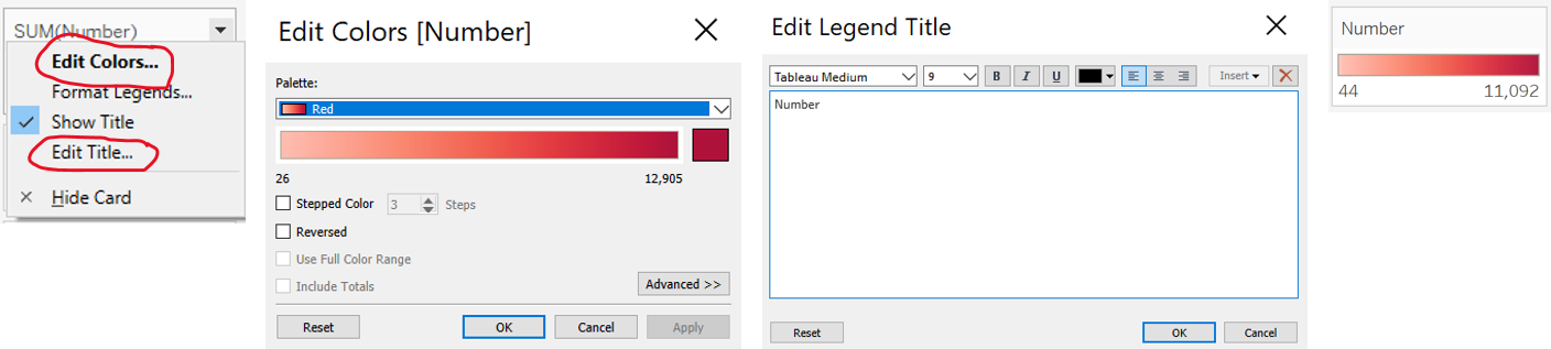
- [A.2] The row label “Count of Sheet1” is omitted from the graph to avoid confusion. Instead of naming as “Count of Sheet1” in the tooltip, it will be named as Number and the line graph is labelled according to what it represents e.g. number of events by event type to give clarity to readers on what the graph represents.
- [A.3] The dots in the Proportional Symbol Map will be coloured according to the event or actor type. A border of a similar and slightly darker colour tone and different opacity are set to allow readers to easily differentiate each point, click and find out more details of each location. Where there are multiple event or actor types at a certain location, readers can either filter according to event or actor type, or click on the relevant event or actor type on the legend.
- [A.4] Each line in line graph is coloured according to the event or actor type, similar to the map, to allow easy visual comparison.
- [A.5] Sorting is not necessary, as a single graph with one common axis is proposed instead.
- [A.6] The Event Id Cnty, Latitude and Longitude can be omitted from the tooltip. More meaningful information such as country, province, location, number of events of fatalities by event or actor type can be made available to the readers instead.
- [I.1] The data visualisation can be filtered by Event Date, Country, Event Type and Actor Type. Country is used as the location filter, instead of province or county, as the data visualisation focuses on comparison among countries and there may be zero or few events or fatalities in some provinces or counties. A choice can also be made whether to show the Number of Events or Fatalities and the Event or Actor Type in the data visualisation. This allows readers to carry out deeper analysis and comparison.
- [I.3] Animation is switched on to allow readers to understand the change in event type, number of events and fatalities as different filters are applied.
Note: Precision is not regarded as a major concern for this data visualisation, hence time and geo precision codes are not taken into account. In addition, other information such as secondary actor(s), associated actor(s), interaction of actor(s) and source that reported event are not considered as the focus of this data visualisation and are omitted.
2.0 Step-by-Step Description of Data Visualisation Preparation
Import into Tableau and Data Preparation
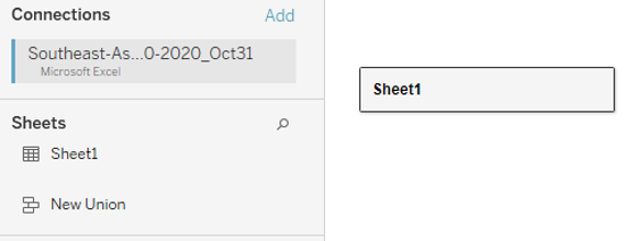
- The Southeast Asia dataset is downloaded from ACLED and imported into Tableau (Figure 3).
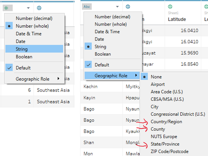
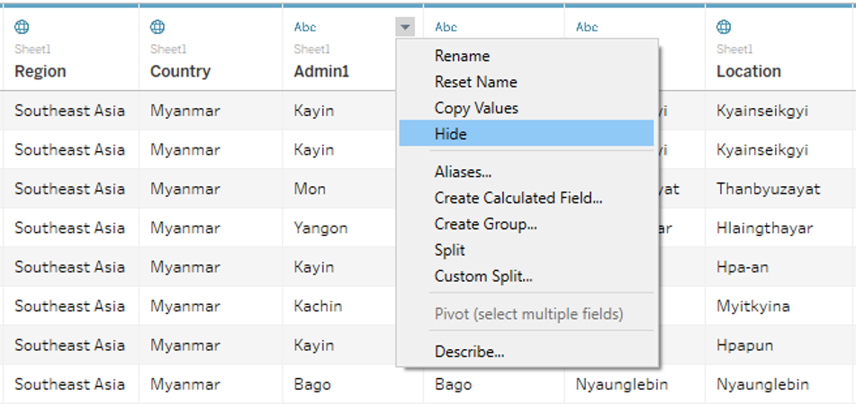
- The data types of the following columns are changed - Inter1 (String), Region (Geographical Role: Country/Region), Admin1 (Geographical Role: State/Province), Location (Geographical Role: County) (Figure 4). As some events have the same Admin1, Admin2 and Admin3, we will only focus on using Country, Admin1 and Location to create and label the maps. Admin2 and Admin3 will not be used.
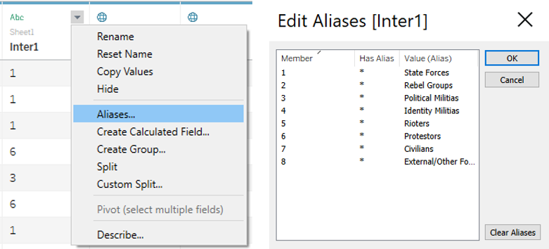
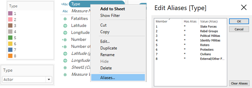
- Next, we edit the Aliases of Inter1 by following the steps in Figure 5.
- Columns that are not used in this data visualisation are hidden (Figure 6). The
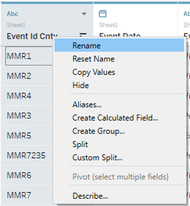
- The following columns are renamed (Figure 7) - Event Id Cnty (Event ID), Actor1 (Actor), Inter1 (Actor Type), Admin1 (Province).
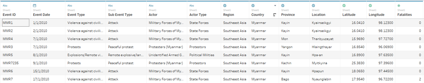
- The final data table to be used for the data visualisation is seen in Figure 8.
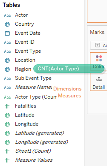
 * Moving on to the Worksheet, Actor Type is shifted to Dimensions (Figure 9).
- Two parameters (Number, Type) are created to allow readers to choose whether to show the number of events or fatalities and event or actor type in the data visualisation (Figure 10).
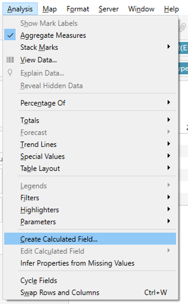
- The following calculated fields are created to count the number of events and to extract the relevant data based on the parameter chosen by readers and display them in the data visualisation (Figure 11).
- Number of Events: 1
- Number: IF [Parameters].[Number]=“Events” THEN [Number of Events] ELSE [Fatalities] END
- Type: IF [Parameters].[Type]=“Event” THEN [Event Type] ELSE [Actor Type] END
Line Graph
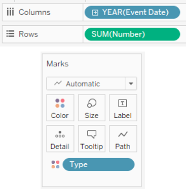
- First, the line graph displaying the number of events or fatalities by event type, number of events or fatalities by actor type in each year is created on a new worksheet.
- Event Date is placed under Columns and it’s kept as Year(Event Date). Number is placed under Rows as it’s kept as Sum. Type is placed under Color (Figure 12).
- Next, we will click on Show Parameter and readers will be able to choose to display the Number of Events or Fatalities by Event or Actor Type (Figure 13).
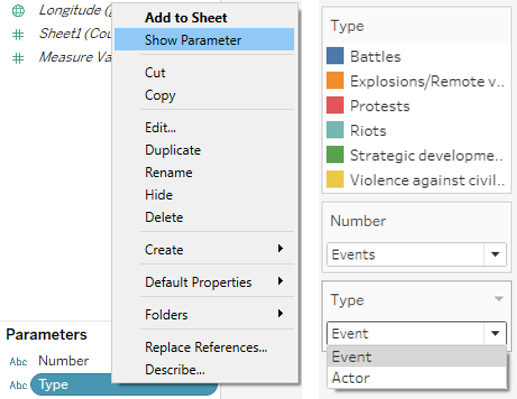
- It is noted that Actor Type will appear in numerical format. Thus, we edit the Aliases of Actor Type by first choosing Actor as Type under Parameter, then edit the Aliases, as seen in Figure 14.
- The field label for Event Date is hidden, given that it’s intuitive. In addition, the axis for Number is edited to remove the title (Figure 15).
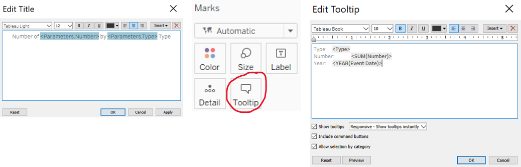
- The title and tooltip of the line graph are edited, as seen in Figure 16. This will reflect the parameter chosen by readers.
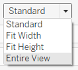
The view is changed to Entire View (Figure 17) and the final interactive line graph is seen in Figure 18.
Choropleth Map
- Next, the Choropleth Map is created on a new worksheet, which displays the number of events or fatalities in each country, coloured by the number of events or fatalities.
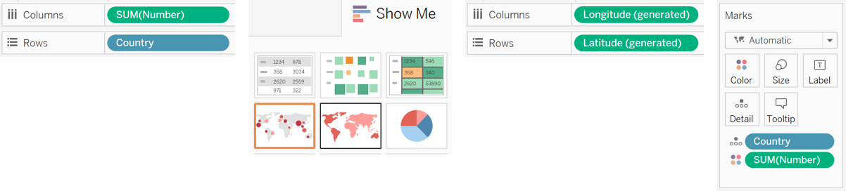
- Number and Country are placed under Columns and Rows respectively. Then, we clicked Show Me and choose the area map. As a result, we should see the following variables in the respective locations - Longitude (generated) (Columns), Latitude (generated) (Rows), Country (Detail), Number (Color) (Figure 19).
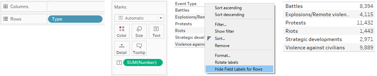
- To allow readers to have an interactive view of the number of events or fatalities by event or actor type in each country under tooltip, a new worksheet (By Type) is created. Type is placed under Rows and Number under Text. The field label for Type is hidden, as it will be labelled under tooltip instead. These steps and the breakdown of number of events or fatalities are seen in Figure 20.
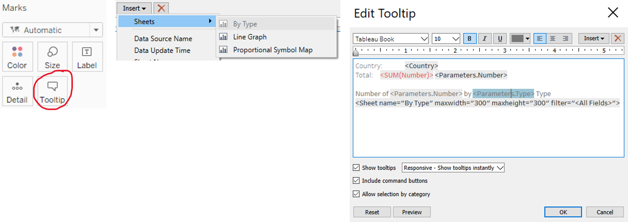
- Next, we return to the Choropleth Map to edit the tooltip. The worksheet “By Type”, containing the breakdown of number of events or fatalities by event or actor type is inserted. The colour and font size of the number of events or fatalities are changed to red and 12 respectively to highlight the total number. These steps and the edited tooltip are seen in Figure 21.
- The colour of the map is changed to red palette to emphasize the drasticity of the events and fatalities and the title is edited to Number (Figure 22). We will also hide the title of the Choropleth Map, as the title will be created in the dashboard (Figure 23).
- The final interactive Choropleth Map is seen in Figure 24.
Proportional Symbol Map
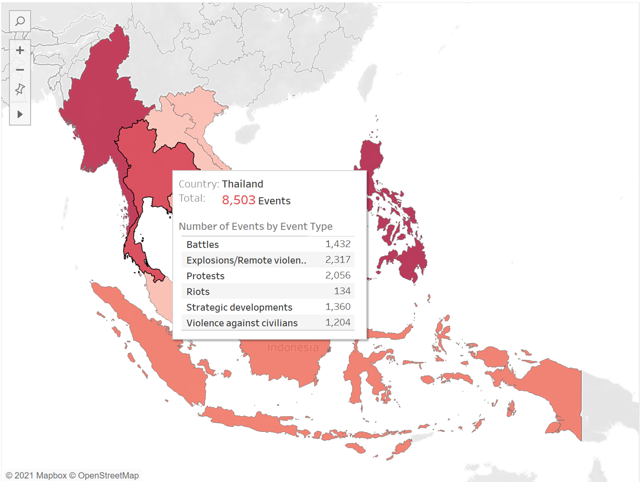
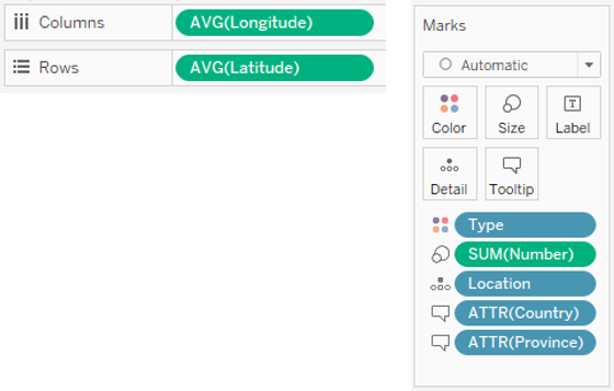
- Next, the proportional symbol map is created on a new worksheet, which displays the number of events or fatalities in each location, coloured by event or actor type and with the size determined by the number of events or fatalities. At each point, the country, province, location (town/village) and the number of events or fatalities by event or actor type by month will be shown under tooltip.
- The following variables are placed in the respective locations seen in Figure 25 - Longitude (Columns), Latitude (Rows), Location (Detail), Number (Size), Type (Colour), Country (Tooltip), Province (Tooltip).
- To allow readers to have an interactive view of the number of events or fatalities by event or actor type by month at each location under tooltip, a new worksheet (By Month) is created. Event Date is placed under Rows and Number under Text. Event Date is changed to month to account for time precision code 3, which is uncertain on the exact date of the event and only has information on the month that it occurred. The field label for Type is hidden, as it will be labelled under tooltip instead. These steps and the breakdown of number of events or fatalities are seen in Figure 26.
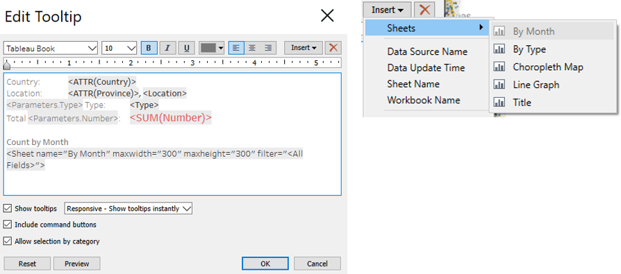
- Next, we return to the Proportional Symbol Map to edit the tooltip. The worksheet “By Month”, containing the breakdown of number of events or fatalities by event or actor type in each month is inserted. The colour and font size of the number of events or fatalities are changed to red and 12 respectively to highlight the total number in the location. These steps and the edited tooltip are seen in Figure 27. Note that the table with the number of events or fatalities in each month may be too long to be seen in the tooltip, but we can filter by event date to find the number in certain month.
- To allow readers to see overlapping points, the opacity (under color) is set to 60%. The size of the dots is also increased so that the location with larger number of events or fatalities can be easily seen. The steps are shown in Figure 28.
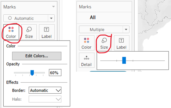
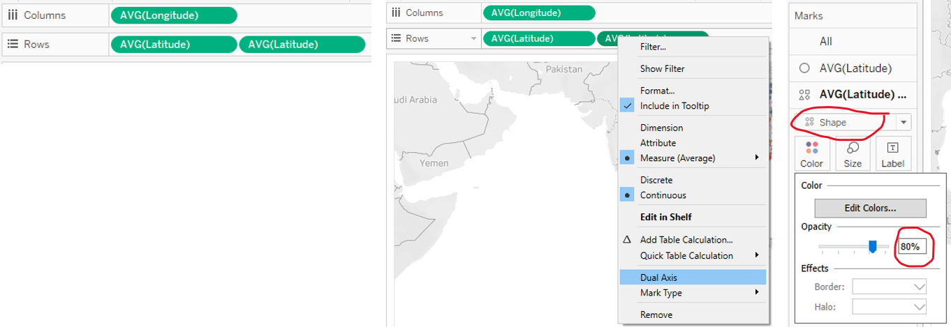
- To create a border of similar and slightly darker colour tone, Latitude is placed under Rows again and we will click on Dual Axis. Next, we will click on one of the Marks card for AVG(Latitude), change it to Shape and change the opacity (under color) to 80%. The steps are shown in Figure 29.
- The final interactive Proportional Symbol Map is seen in Figure 30.
Interactive and Synchronised Filters
- Next, we will create filters that can be applied across the worksheets. This will allow readers to change the filters on the interactive dashboard and the filters will be applied in the relevant maps and line graph.
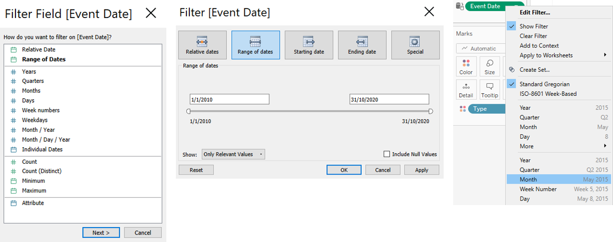
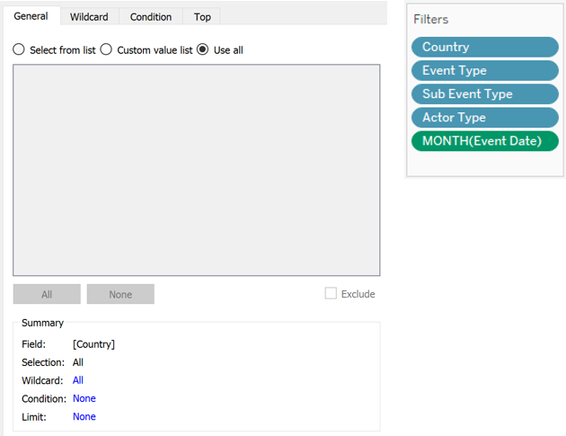
- We return to the line graph to insert the filters. We will move the following variables under Filters - Country, Event Type, Sub Event Type, Actor Type, Event Date. For Event Date, we will filter by range of dates, choose the full range of event date and change to month (continuous) (Figure 31). This accounts for time precision code 3, which is uncertain on the exact date of the event and only has information on the month that it occurred. For the rest of the variables, we will choose to use all and the full list of filters is seen in Figure 32.
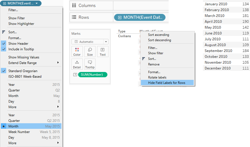
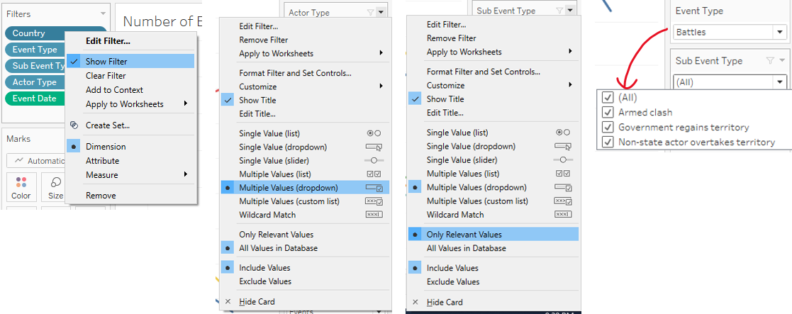
- We will then click “Show Filter”. The setting of the Country, Event Type, Sub Event Type and Actor Type filters will be set to “Multiple Values (dropdown)”. The setting of all the filters are also set to “Only Relevant Values”, so that the filters can respond to each other e.g. only the relevant sub events will appear when a particular event is chosen as filter by the reader. These steps are shown in Figure 33.
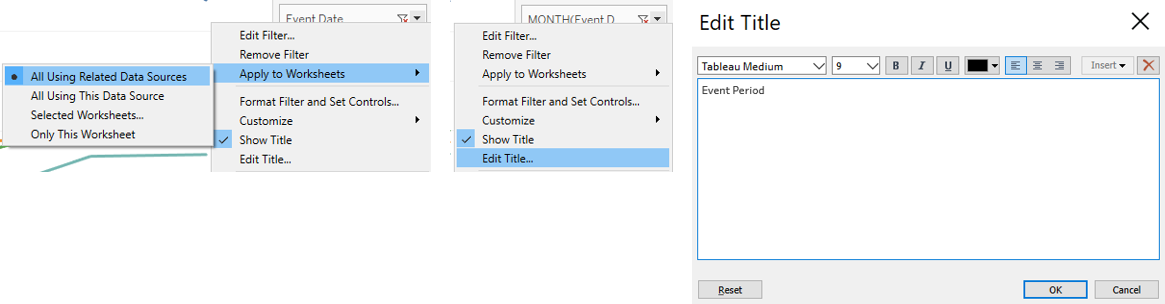
- The various filters are then changed to apply to all using related data sources, so that the maps, line graph and tooltip will respond to the filters selected by readers. The title of “MONTH(Event Date)” filter is edited to Event Period. The steps are shown in Figure 34.
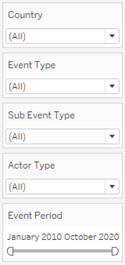
- The final list of filters is seen in Figure 35.
Title / Lead-in Paragraph
- To create the title or lead-in paragraph to show readers the total number of events and fatalities based on the filters that they apply, a new worksheet (Title) is created.
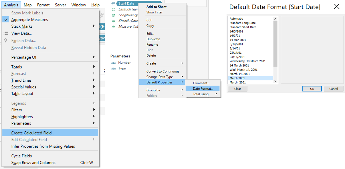
- To show the start and end date based on the Event Period filter chosen by the readers, the following calculated fields are created. The date format of Start Date and End Date are changed to Month-Year. These steps are seen in Figure 36.
- Start Date: MIN([Event Date])
- End Date: MAX([Event Date])
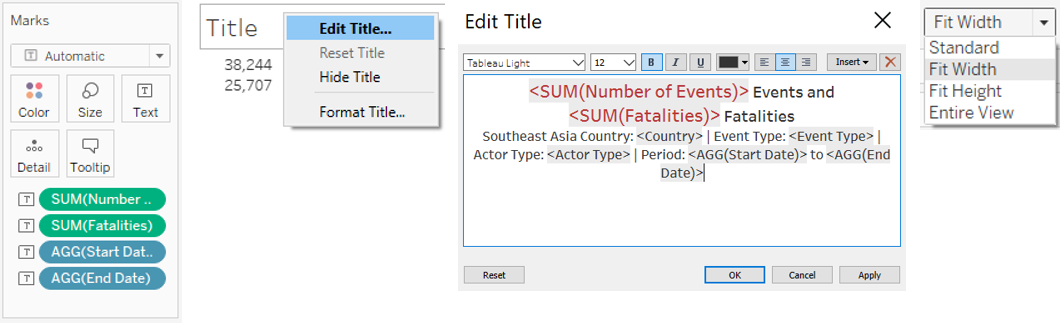
- We will then place Number of Events, Fatalities, Start Date and End Date under Text, before editing the title and setting the view to Fit Width, as seen in Figure 37. The total number of events and fatalities are in red and larger font size to highlight these overall numbers to readers.
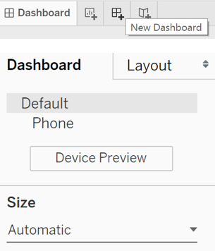
Dashboard
- Finally, the dashboard is created. First, the size is changed to Automatic (Figure 38).
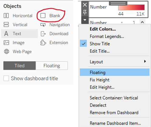
- The 4 worksheets (Title, Choropleth Map, Proportional Symbol Map, Line Graph) are added to the dashboard. A blank is added for the legends, filters and parameters to be placed. The various side bars (legends, filters, parameters) are changed to Floating to allow easy size adjustment (Figure 39).
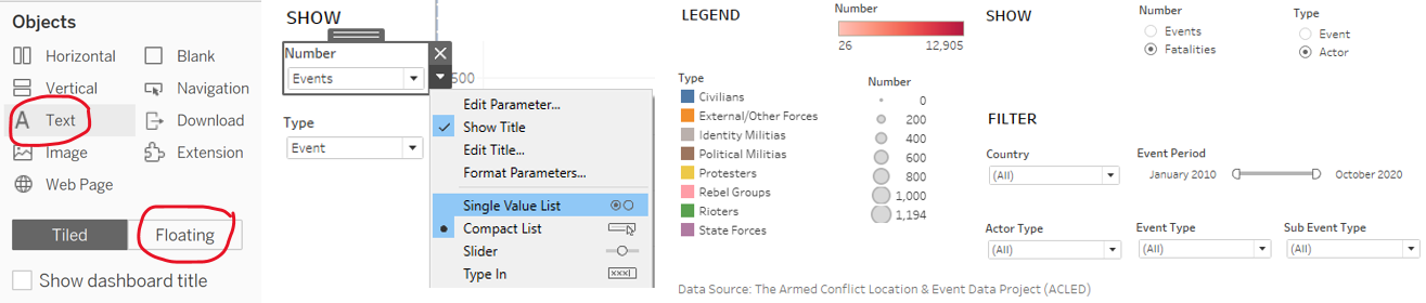
- The relevant text descriptions are added to direct readers on how to use the filters and parameters in the dashboard and to add the data source. This is done by adding a floating text object. The parameters are changed to single value list to make it quicker for readers to choose what they want to see. Figure 40 shows the steps and the legends, filters, parameters and data source that will be shown on the dashboard.
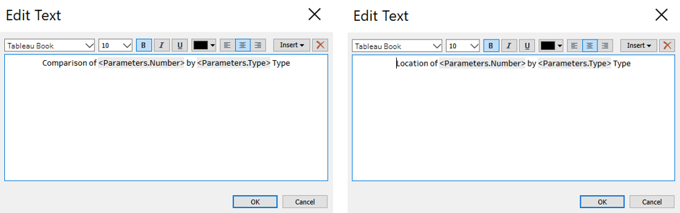
- Floating text objects are also added to label the maps. Figure 41 shows the text that will be added to label the Choropleth Map and Proportional Symbol Map respectively. The labels will change based on the parameters chosen by the readers.
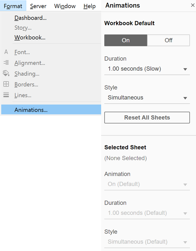
- To allow readers to observe the changes when different filters and parameters are applied, the animation is switched on (Figure 42).
3.0 Proposed Data Visualisation Using Tableau
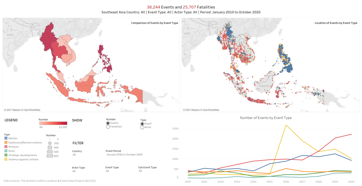
Figure 43 shows the dashboard.
Major Observations
- Observation 1: More than half of political violence, demonstration or select non-violent, politically important events in Southeast Asia from 2010 to 2020 were in Philippines and Myanmar. In 2016 and 2020, a large percentage of events were violence against civilians and protests respectively. These are shown in Figure 44.
- Out of 38,244 events, Philippines and Myanmar had 11,092 and 10,482 events respectively, which makes up 56.4% of all events.
- In 2016, 2,678 out of 5,412 (49.5%) events were violence against civilians. In 2020 (data for Jan - Oct 2020), 2,224 out of 5,227 (42.5%) events were protests. Note that we can filter according to event date to have a quick calculation of total number of events for the specified time period.
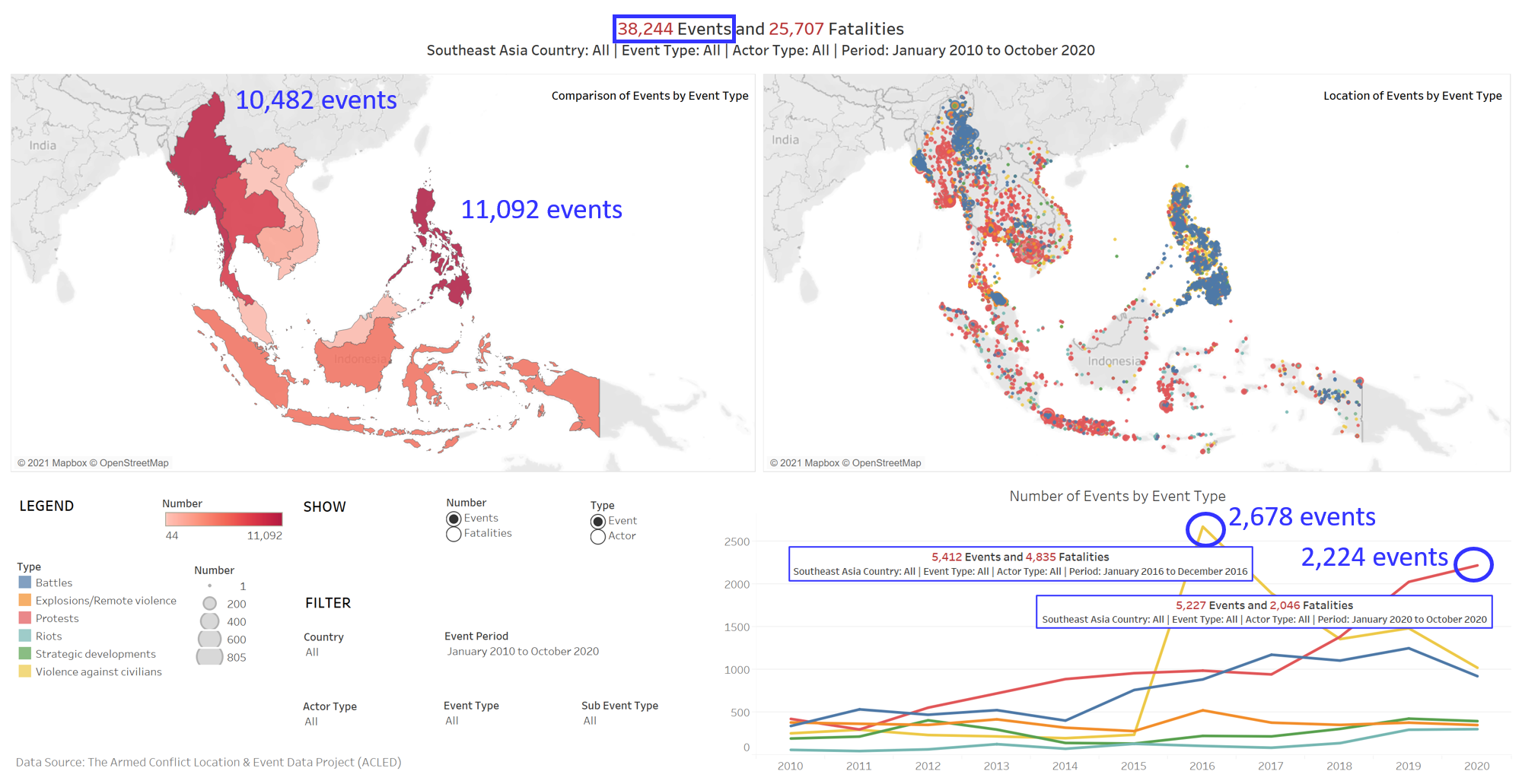
- Observation 2: Majority of fatalities from events in Southeast Asia from 2010 to 2020 occurred in Philippines and Myanmar. From 2010 to 2020, the fatalities were mostly caused by violence against civilians and battles, or by state forces, political militias and rebel groups. These are shown in Figure 45.
- Out of 25,707 fatalities, Philippines and Myanmar had 12,905 and 8,913 fatalities respectively, which makes up 84.9% of all fatalities.
- From the line graphs, we observe that violence against civilians and battles (event type), state forces, political militias and rebel groups (actor type) were the main contributors of fatalities from 2010 to 2020. From observation 1, we noted the large percentage of violence against civilians in 2016, which also caused a large percentage of fatalities i.e. 3,569 out of 4,835 (73.8%) fatalities.
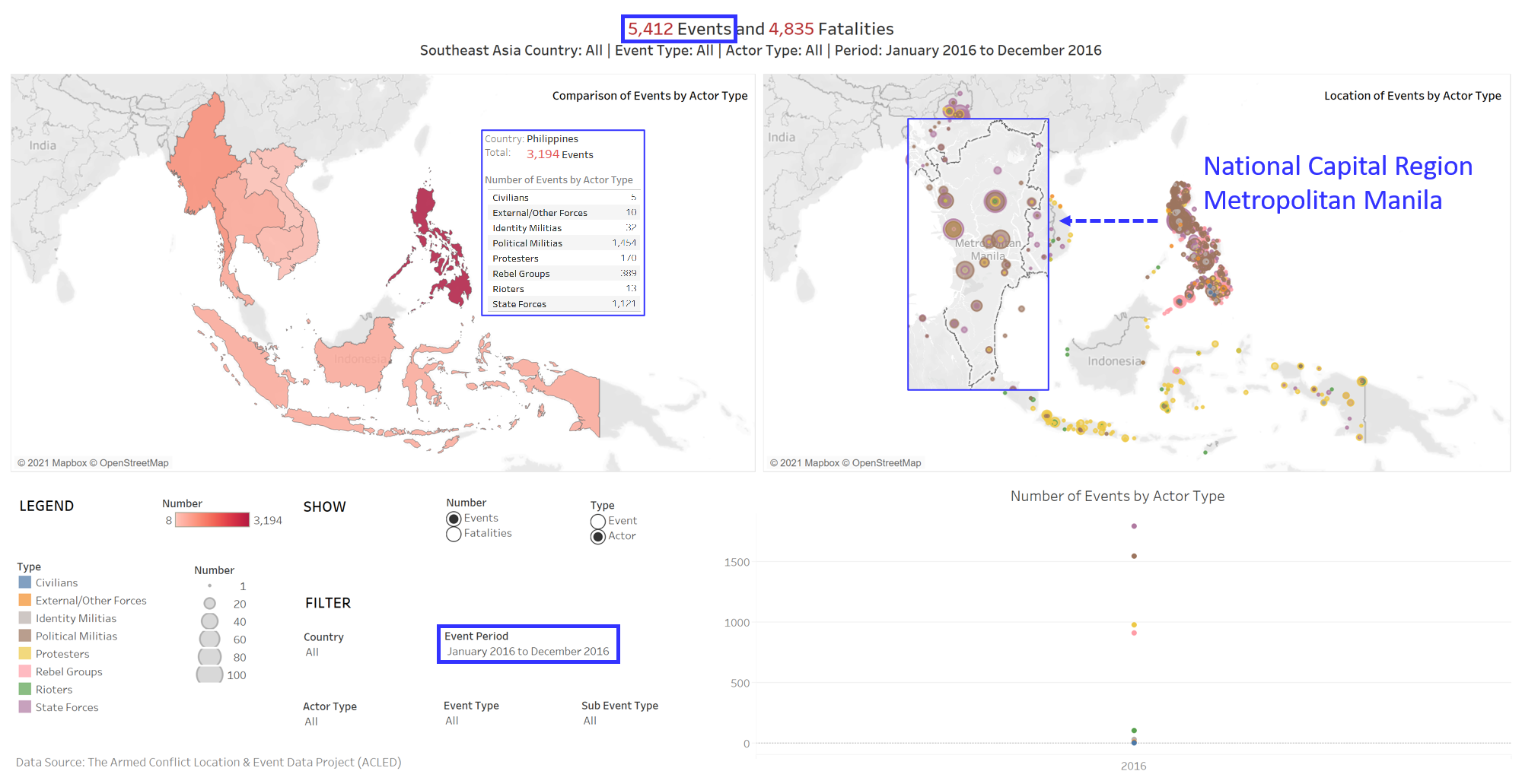
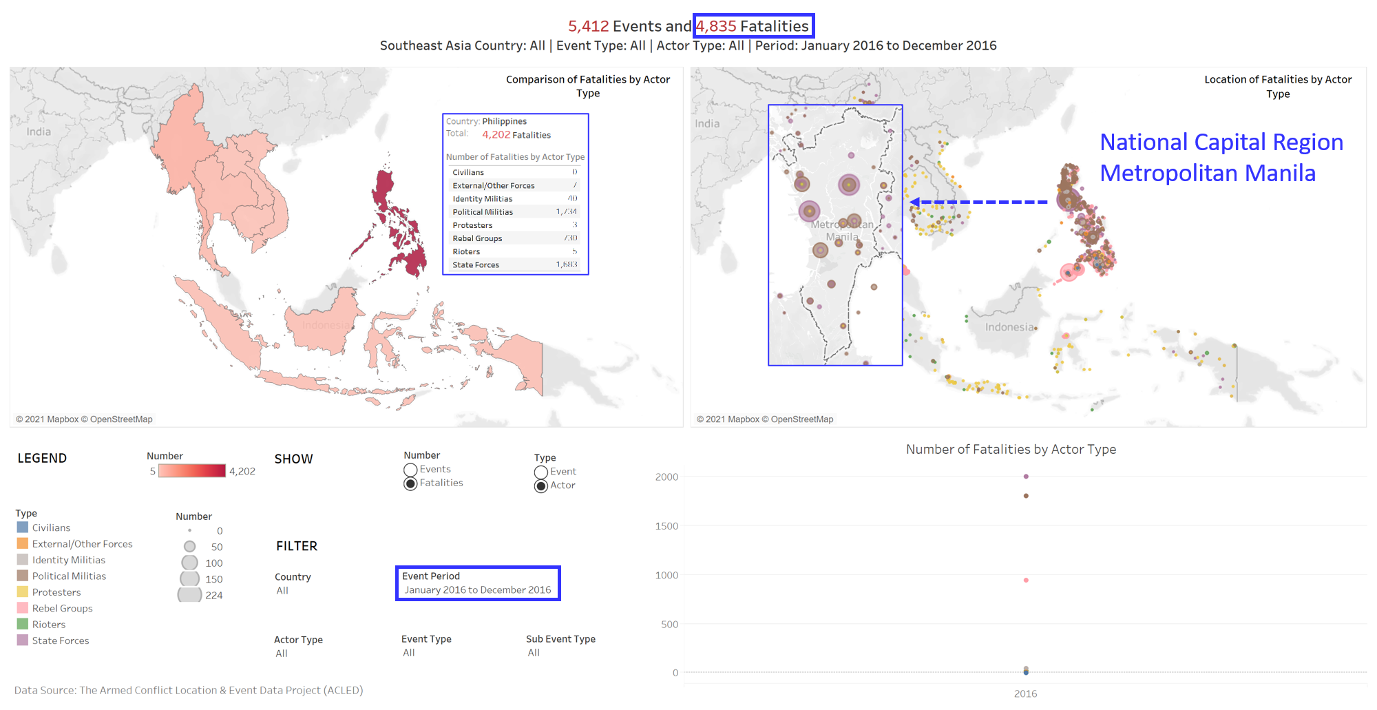
- Observation 3: Majority of events and fatalities in Southeast Asia in 2016 occurred in Philippines. The events and fatalities were mostly caused by state forces and political militias. A large number of event and fatalities in Philippines occurred in National Capital Region (Metropolitan Manila). These are shown in Figure 46-47.
- Out of 5,412 events and 4,835 fatalities, Philippines had 3,194 events (59.0%) and 4,202 fatalities (86.9%) in 2016.
- A large number of events and fatalities in Philippines in 2016 occurred in National Capital Region, Metropolitan Manila, as illustrated by the larger dots. 45.5% (1,454) and 35.1% (1,121) of events were by Political Militias and State Forces respectively. 41.3% (1,734) and 40.1% (1,683) of events were by Political Militias and State Forces respectively. This could be due to the Antidrug Campaign by the Philippines government in 2016.
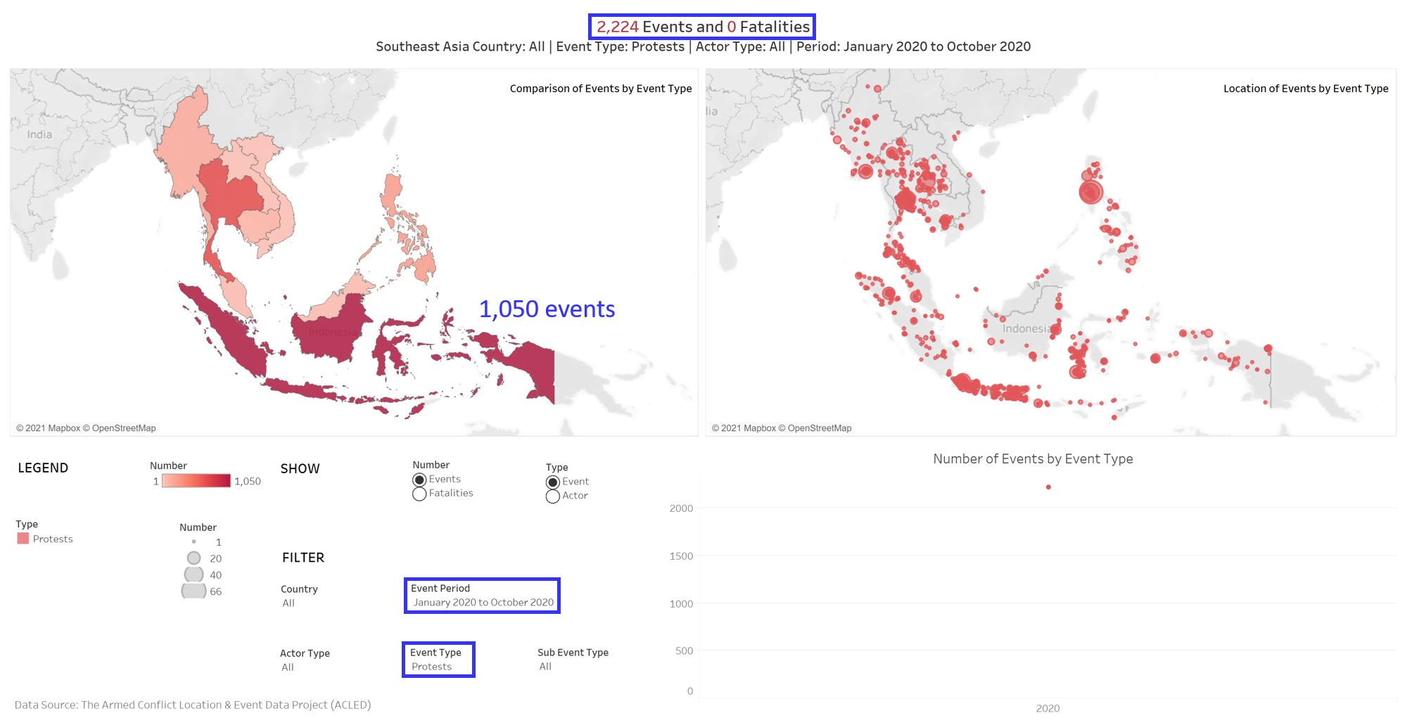
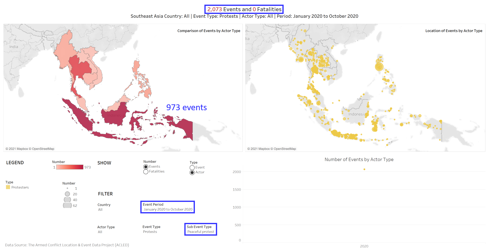
- Observation 4: A large percentage of protests happening in Southeast Asia in 2020 was in Indonesia. These protests did not result in any fatality. Majority of these protests were peaceful protests. These are shown in Figure 48-49.
- From observation 1, we noted the large percentage of protests in Southeast Asia in 2020. Out of 2,224 protests in Southeast Asia, 1,050 (47.2%) occurred in Indonesia. 92.7% (973) of the protests in Indonesia were peaceful protests. These makes up 46.9% of all peaceful protests (2,073) in Southeast Asia in 2020. This could be due to the Indonesia Omnibus Law Protests in 2020.
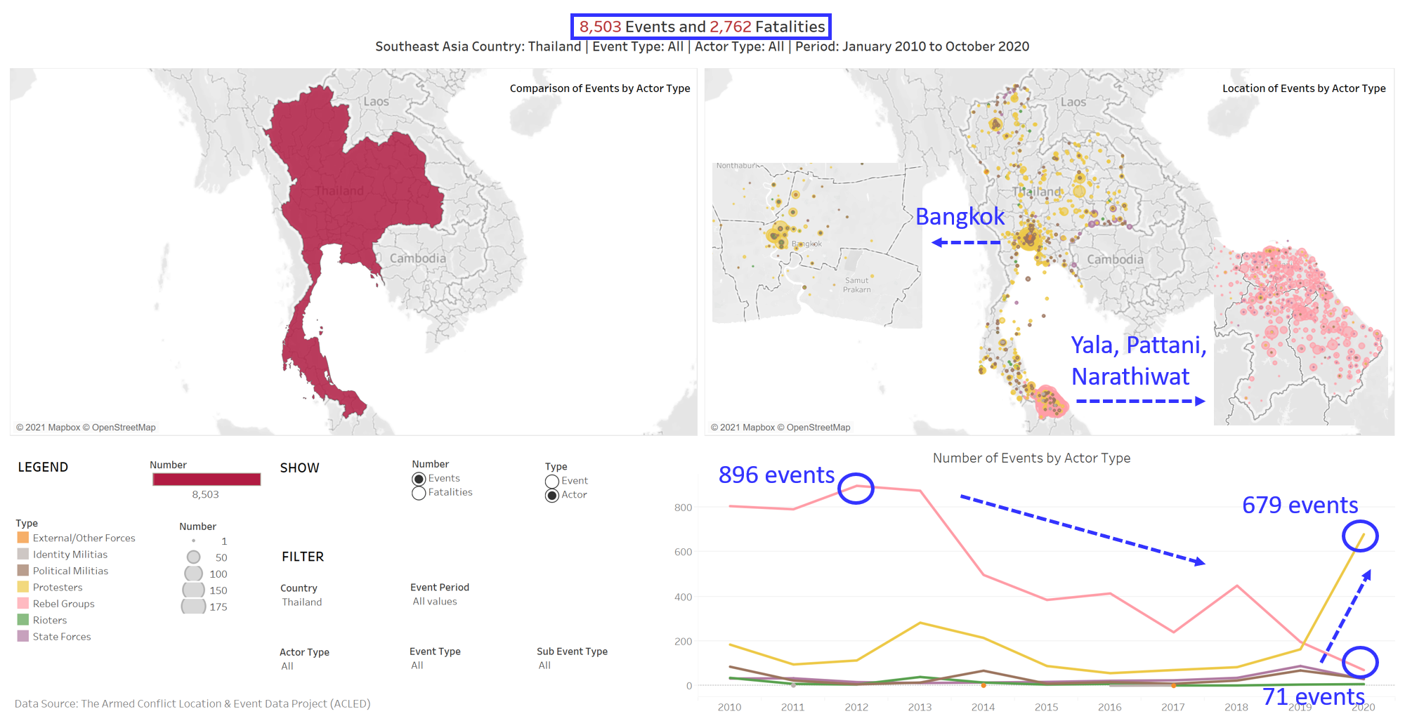
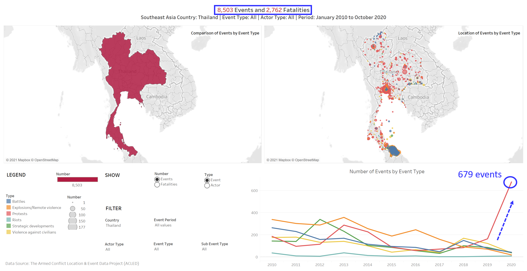
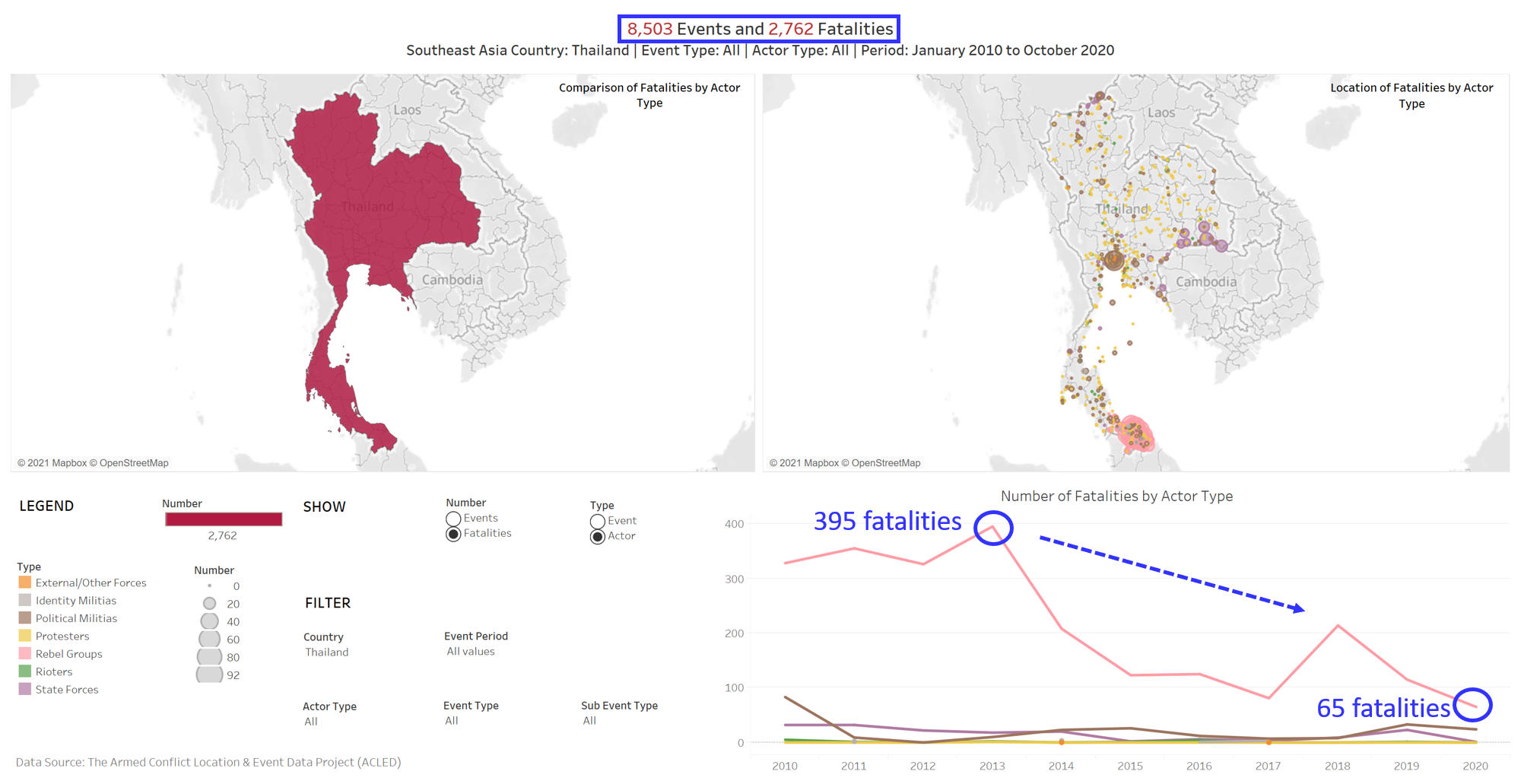
- Observation 5: The number of events and fatalities caused by rebel groups in Thailand decreased from 2010 to 2020. At the same time, the number of events (protests) by protestors increased sharply in 2020. Most of the events by protestors and rebel groups were in Bangkok and Yala/Pattani/Narathiwat respectively. These are shown in Figure 50-52.
- From 2010 to 2020, the number of events by rebel groups decreased to 71 in 2020, with the highest at 896 in 2012. The number of fatalities by rebel groups also decreased to 65 in 2020, with the highest at 395 in 2013. This could be due to the inactivity of South Thailand Insurgency in recent years. As illustrated by the larger dots, a larger number of such events occurred in Yala, Pattani and Narathiwat, which are in the Southern part of Thailand.
- In 2020, the number of events (protests) by protestors increased sharply to 679. As illustrated by the larger dots, a larger number of such events occurred in Bangkok. This could be due to the 2020-2021 Thai Protests against the government.