1.0 Critiques and Improvements of Data Visualisation
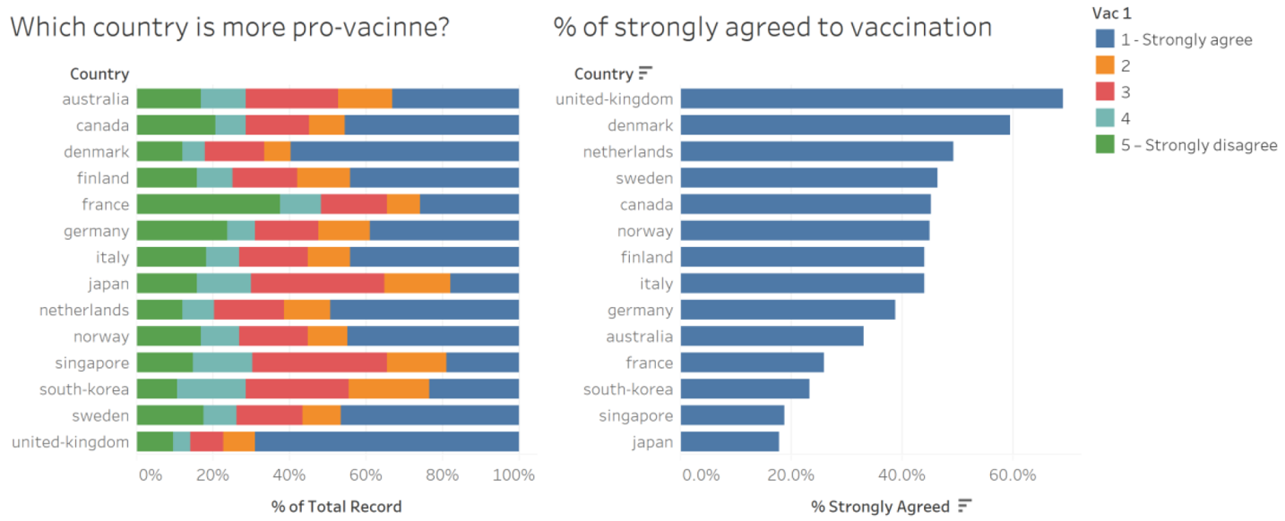
A research team is currently conducting a study to understand the willingness of the public on Covid-19 vaccination. The research utilises data from surveys conducted in January 2021. The data is from Imperial College London YouGov Covid 19 Behaviour Tracker Data Hub and is hosted at Github. Figure 1 shows two data visualisations created by one of the research scientists of the research.
Clarity
- [C.1] The data visualisation is titled “Which country is more pro-vacinne” and “% of strongly agreed to vaccination”. However, this does not accurately represent the survey question shown by the data visualisation, which is “If a Covid-19 vaccine were made available to me this week, I would definitely get it”. Furthermore, there are other questions that show whether a country is pro-vaccine e.g. whether they are worried about side effects, whether they will regret not getting the vaccine, etc.
- [C.2] The research team uses a general term “pro-vacinne”. Although they went on to show a data visualisation on “% of strongly agreed to vaccination”, it leaves readers guessing whether “pro-vacinne” means strongly agree and/or agree. The title could have been more specific to make it clear to readers what survey response is represented by the data visualisation.
- [C.3] There is no lead-in paragraph in the data visualisation to show the key message. Readers may only pick up that a higher percentage of survey respondents in the United Kingdom “strongly agreed to vaccination”, but cannot compare it with the average percentage for all countries surveyed. Furthermore, the data visualisation does not give the total number of survey respondents from the countries. As such, readers cannot find out the exact number of survey respondents that provided certain response to a specific survey question.
- [C.4] The demographics of survey respondents are not shown in the data visualisations. As such, readers are not able to compare and understand the sentiments of survey respondents of different demographics e.g. male vs female.
- [C.5] The data source is not cited in the data visualisation. This is not ideal, as readers will not be able to find out more about the background and details of the data source.
- [C.6] The number of survey respondents from each country is different i.e. different sample sizes. Thus, it’s unfair to compare and inappropriate to display the survey response percentage in a bar chart. Different levels of error or confidence levels should be catered for.
Aesthetics
- [A.1] The use of the 100% stacked bar chart makes it visually difficult to compare the percentage for each survey response e.g. strongly agree, agree, etc. Instead of using diverging colours to represent the likert scale, it uses 5 different colours, which can be distracting and may not be intuitive to readers that it’s a likert scale. Furthermore, 2, 3 and 4 are not labelled, so readers may not instantly know that they represent “Agree”, “Neutral” and “Disagree”.
- [A.2] The 100% stacked bar chart is sorted in alphabetical order, while the other bar chart is sorted in descending order by percentage that strongly agreed. This makes it hard for readers to compare both charts and find out the overall survey response for a specific country that have the highest percentage for “strongly agreed” i.e. United Kingdom.
- [A.3] The use of different number of decimal places in both charts is inconsistent. The 100% stacked bar chart uses 0 decimal place, while the other bar chart uses 1 decimal place. This is generally not a good practice for charts that are compared and directly relate to each other.
- [A.4] The data visualisation indicates “Vac 1”. However, it’s not clear to readers what the survey question is, unless they refer to the data source, which is not indicated as well.
Sketch of Proposed Design
Figure 2 shows the sketch of the proposed data visualisation to replace the one done by the research team. It will address the critiques which were mentioned earlier.
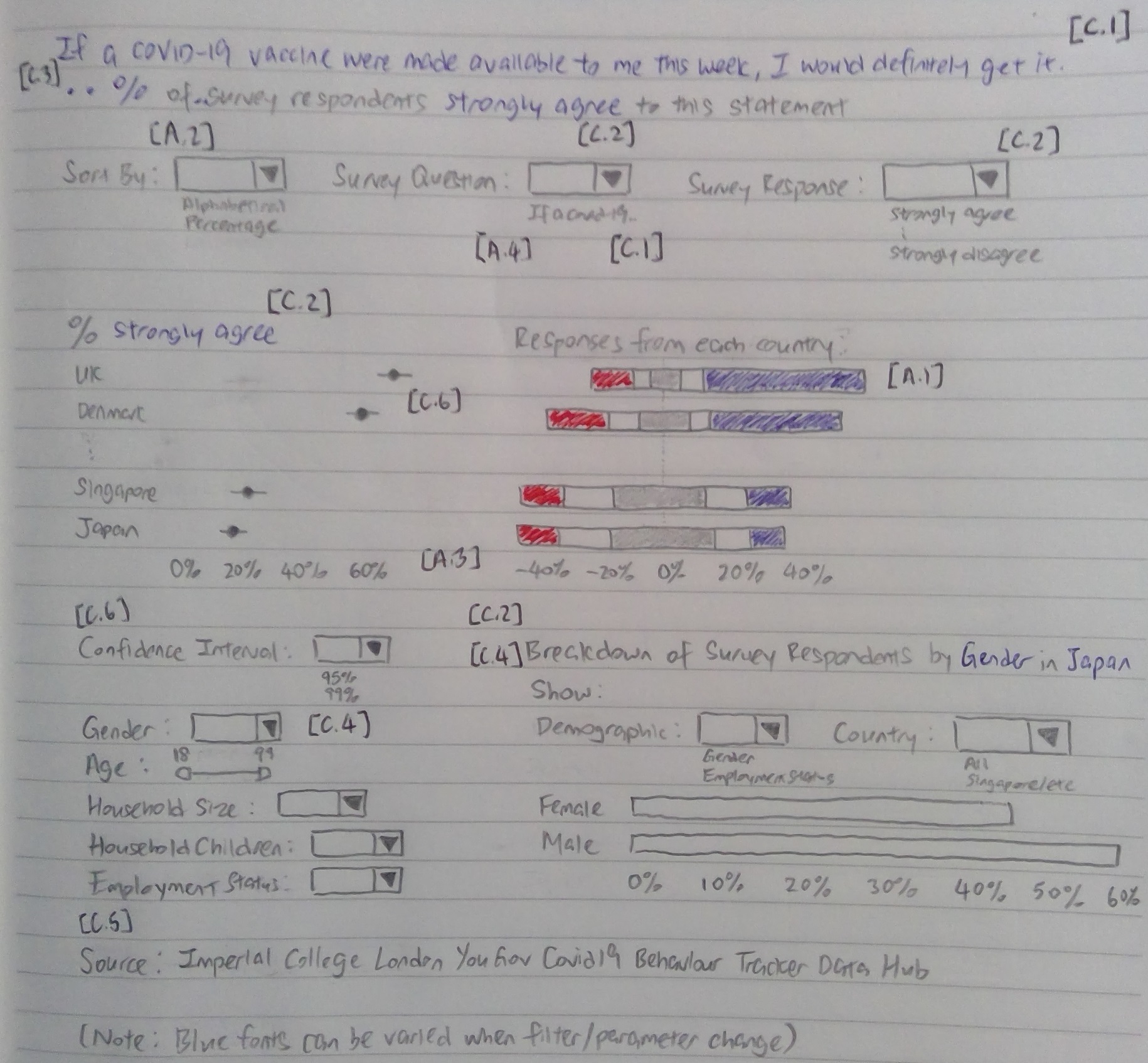
- [C.1] A filter is shown such that readers can choose the survey question. The survey question will be reflected in the title and all data visualisations or charts will change whenever the reader selects a different survey question.
- [C.2] Specific terms are used e.g. strongly agree, agree, neutral, disagree and strongly disagree to make the chosen survey response clear to readers. Readers can also choose the survey response to look at and the title, dot plot and bar chart (breakdown of survey respondents) will change accordingly.
- [C.3] The title or lead-in paragraph can be changed by readers according to the chosen Survey Question, Survey Response and filters. It will give readers an overview on the overall survey response percentage and number of survey respondents for the selected survey question. Each data visualisation or chart will also show the number of survey respondents under each point or bar using Tooltip.
- [C.4] Readers can use the bar chart (breakdown of survey respondents) to compare and understand the sentiments of survey respondents of different demographics. In addition, they can filter based on each demographic to analyse and compare how the various data visualisations change.
- [C.5] The data source will be labelled at the bottom of the data visualisation or dashboard.
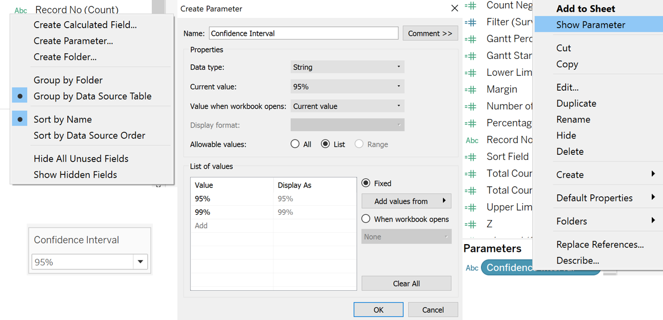
- [C.6] A parameter is created such that readers can change the confidence interval. This allows a better comparison of survey responses from countries with different sample sizes. The error bars on the dot plot will change when a different confidence interval is chosen.
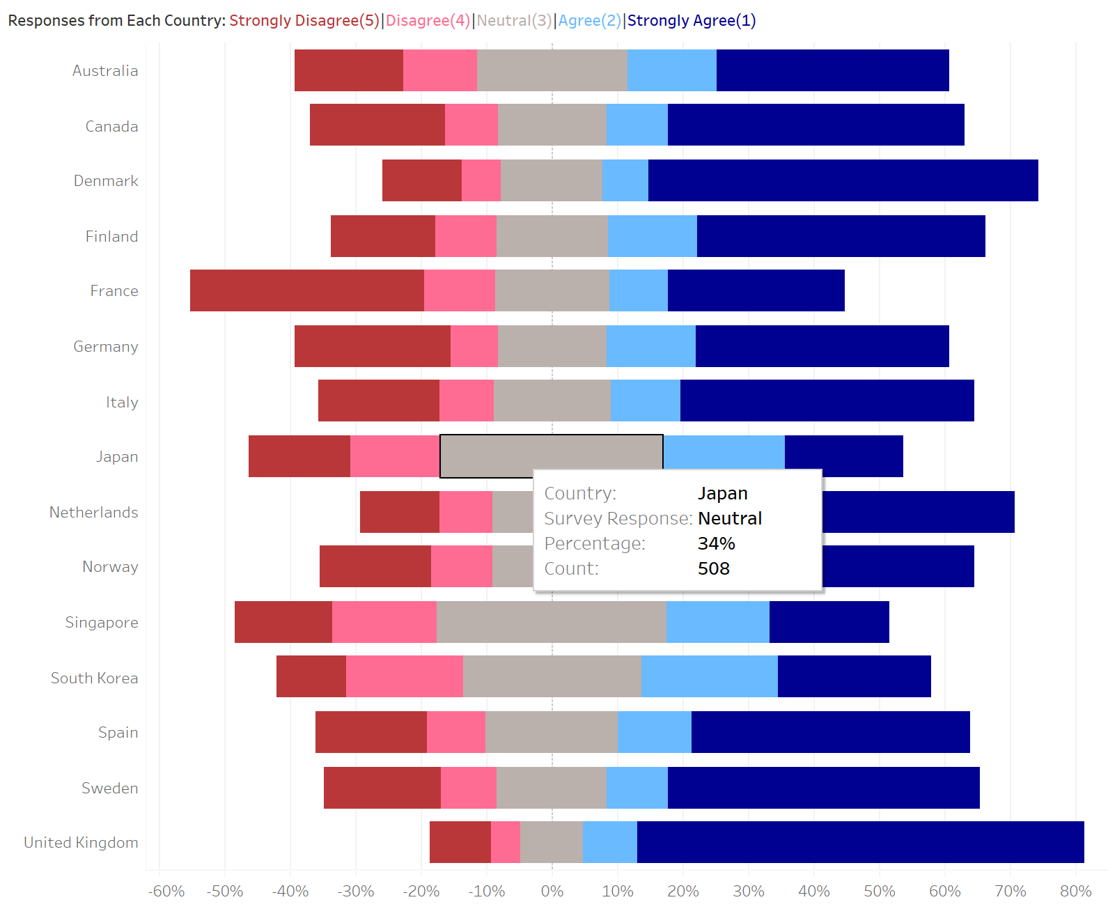
- [A.1] A diverging stacked bar chart is used to represent the survey response (likert scale) instead. Diverging colours are used i.e. dark blue for strongly agree to dark red for strongly disagree. Each survey response is labelled appropriately for clarity to readers.
- [A.2] Parameters are created to allow readers to sort both the dot plot and diverging stacked bar chart at the same time. This allows better comparison of the survey responses from each country.
- [A.3] All the data visualisations or charts, titles and tooltips are standardised to show percentage in 0 decimal place.
- [A.4] The survey questions are properly named for clarity to readers.
2.0 Step-by-Step Description of Data Visualisation Preparation
Data Preparation
- The survey data from Imperial College London YouGov Covid 19 Behaviour Tracker Data Hub, hosted at Github, is downloaded by running Git Clone on RStudio ($ git clone https://github.com/YouGov-Data/covid-19-tracker).
- Data files containing responses to the 6 surveys (vac_1, vac2_1, vac2_2, vac2_3, vac2_6, vac_3) and the attributes (gender, age, household_size, household_children, employment_status) are used. This include data from Australia, Canada, Denmark, Finland, France, Germany, Italy, Japan, Netherlands, Norway, Singapore, South Korea, Spain, Sweden and United Kingdom. The relevant columns are extracted via Excel.
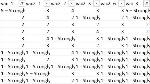
- Each country’s data file is filtered on Excel and only rows containing responses to the 6 surveys are extracted (Figure 3).
- For Denmark, Finland, Norway and Sweden, the responses to employment status are separated into many columns. IF formula is used on Excel to collate the survey respondent’s employment status in a single column and rename to the respective employment status (Full time employment, Part time employment, Full time student, Retired, Unemployed, Not working, Others) (Figure 4).

- Under the columns with the survey responses, “1 - Strongly agree” and “5 - Strongly disagree” are renamed to “1” and “5” respectively to allow the diverging stacked bar chart to be built subsequently.
- Under the column with household size, “8” is renamed to “8 or more”.
- Under the column with household children, “5”, “6”, “7” and “8” are renamed to “5 or more” and “Don’t know” to “Prefer not to say”.
- The various countries’ data files are merged in Excel and a column is added to indicate the Country. The final dataset is saved as cleaned.xlsx. A sample of final dataset is seen in Figure 5.

Import into Tableau
- The cleaned.xlsx is imported into Tableau (Figure 6).
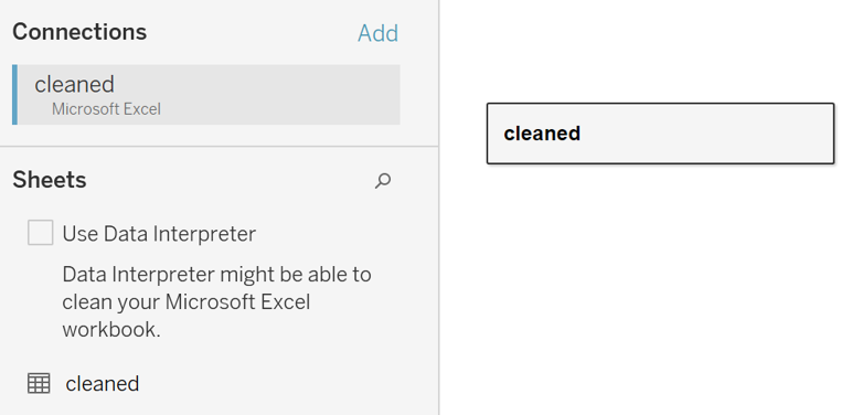
- The data types of Record No, Household Size and Household Children are changed to String (Figure 7).

- The vac_1, vac2_1, vac2_2, vac2_3, vac2_6 and vac_3 columns are renamed to the respective survey questions (Figure 8). The columns are clicked and pivoted (Figure 9). This will form two columns, one for Survey Question and another for Survey Response. The two columns are renamed accordingly. Figure 10 shows the data table used for subsequent data visualisations.


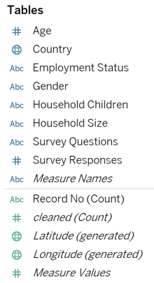
- Moving on to the Worksheet, the Age, Country, Employment Status, Gender, Household Children, Household Size, Survey Question and Survey Response should be under Dimensions (Figure 11).
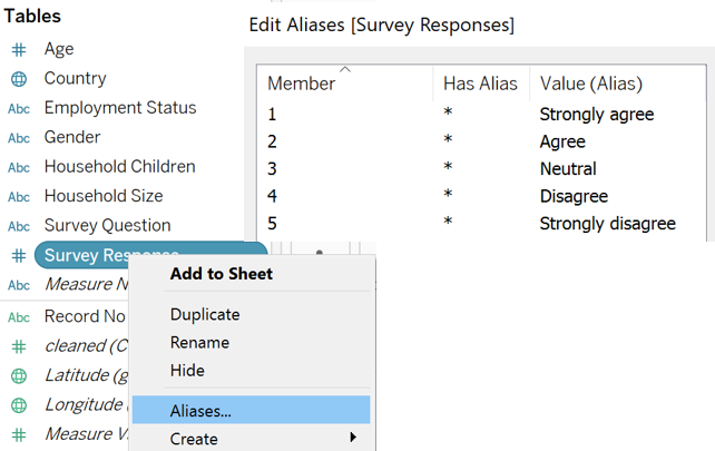
- Next, we right click Survey Response to edit the aliases to the respective Survey Response (Strongly Agree, Agree, Neutral, Disagree, Strongly Disagree) to be clear to readers, as seen in Figure 12.
Diverging Stacked Bar Chart
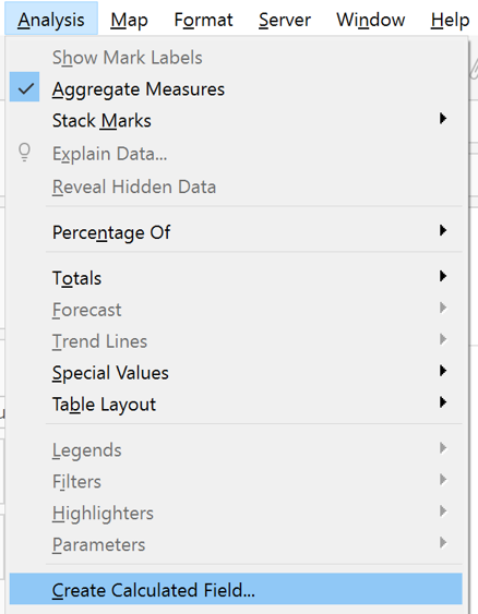
- First, we created calculated fields by following the step shown in Figure 13. The following calculated fields are created:
- Number of Records: 1
- Total Count: TOTAL(SUM([Number of Records]))
- Count Negative: IF [Survey Response]>3 THEN 1 ELSEIF [Survey Response]=3 THEN 0.5 ELSE 0 END
- Total Count Negative : TOTAL(SUM([Count Negative]))
- Percentage: SUM([Number of Records])/[Total Count]
- Gantt Start: -[Total Count Negative]/[Total Count]
- Gantt Percent: PREVIOUS_VALUE([Gantt Start])+ZN(LOOKUP([Percentage],-1))
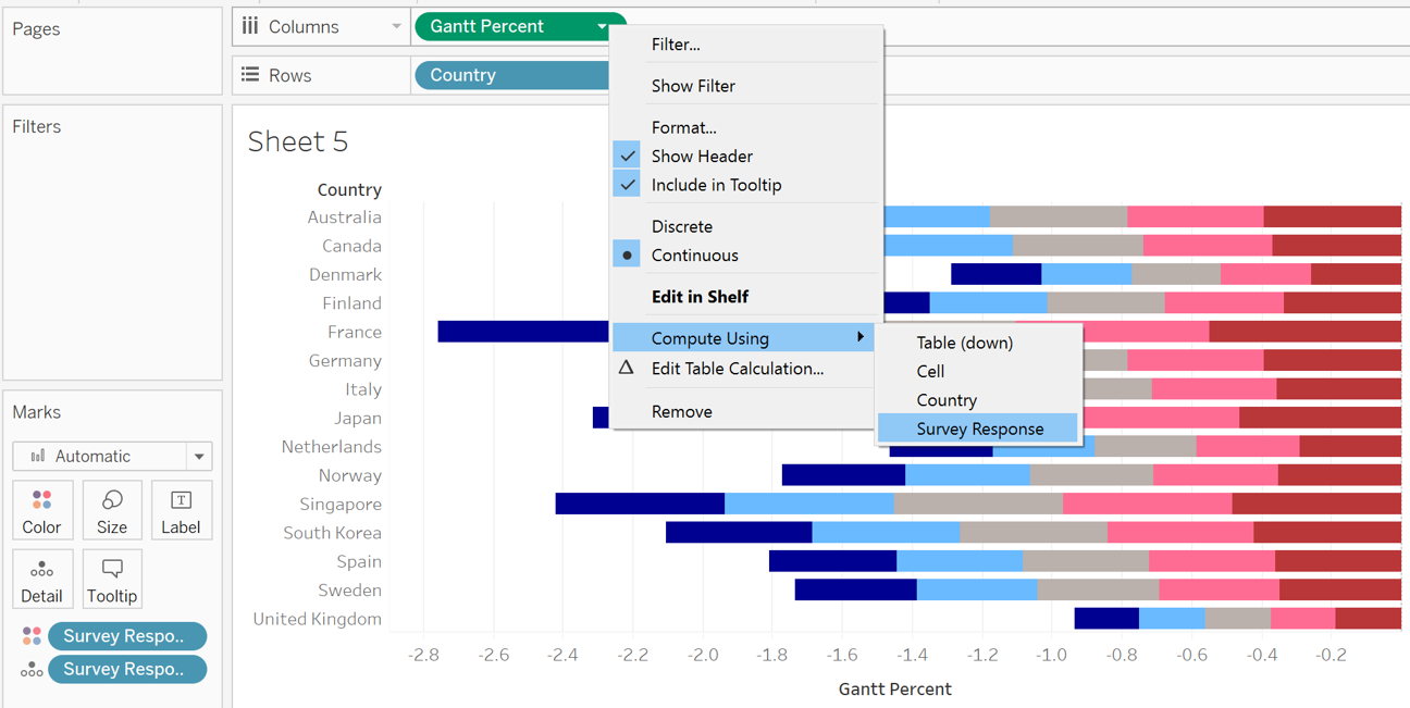
- Next, Survey Response is placed under Detail and Color, Gantt Percent under Columns (Compute Using Survey Response) and Country under Rows. This is shown in Figure 14.
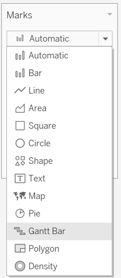
- The data visualisation or chart is changed to Gantt Bar (Figure 15).
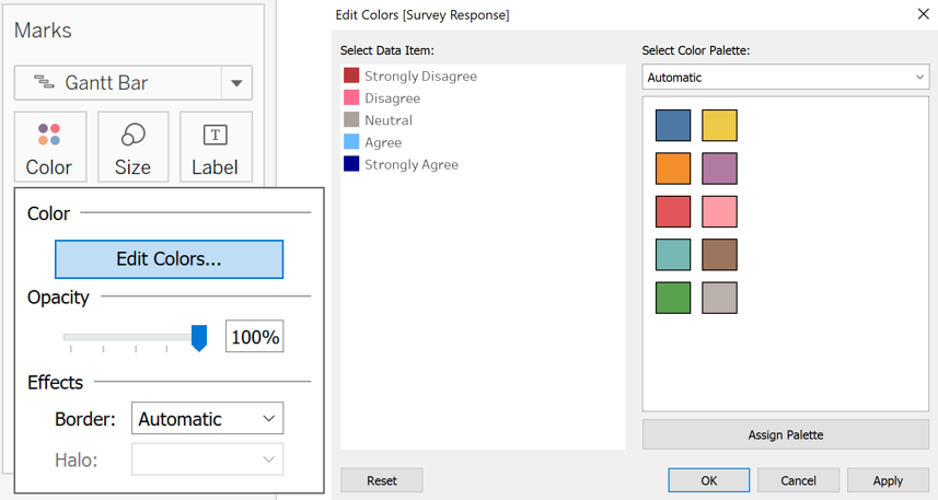
- Percentage is then placed under Size, computed using Survey Response. The colours for Survey Response are edited to diverging colours. This is shown in Figure 16.
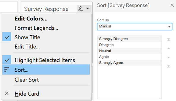
- As it’s a good practice for negative (strongly disagree and disagree) survey responses to be on the left and positive (strongly agree and agree) survey responses to be on the right, Survey Response is manually sorted, as seen in Figure 17.
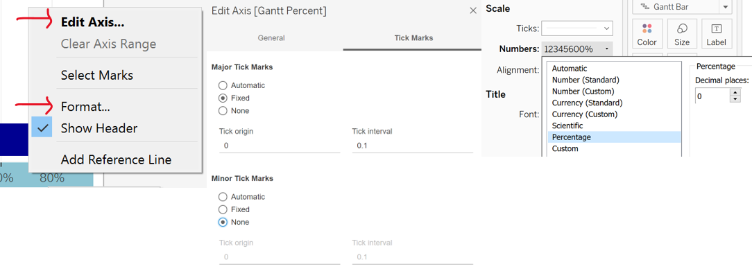
- We will standardise the axis labels for Percentage to 0 decimal place, with 0.1 tick interval. We will right click to edit axis and format, as shown in Figure 18.
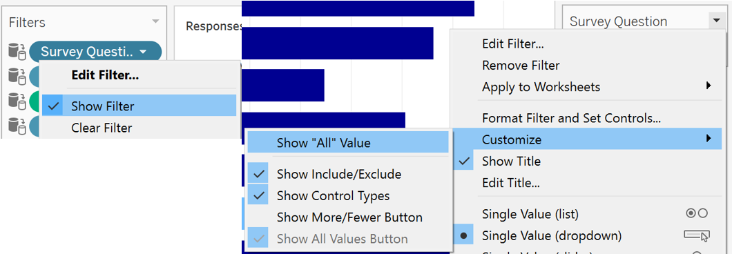
- To allow readers to select the survey question, Survey Question is placed under Filters. We will right click to Show Filter and the filter will appear on the right of the worksheet. The filter is changed to Single Value (dropdown) and customised to not show “All” value, as it’s not useful to show the response to all surveys together. This is shown in Figure 19.
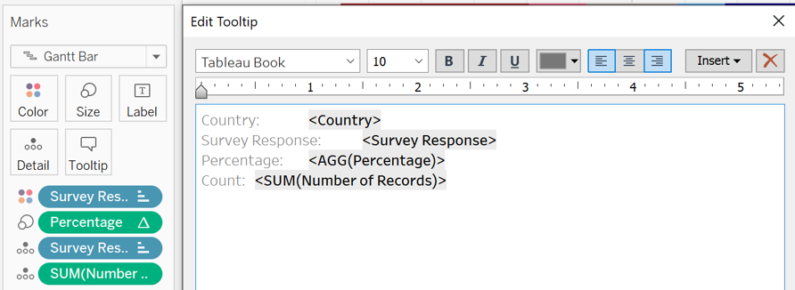
- Next, we will place Number of Records under Detail to show the number of survey respondents and edit Tooltip, as seen in Figure 20. Percentage is formatted to 0 decimal place (as explained in Figure 18).
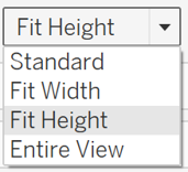
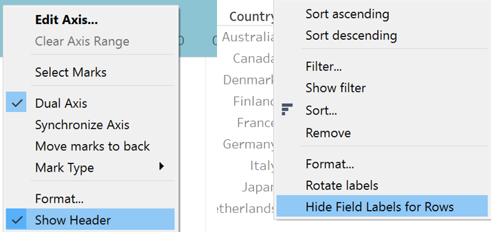
- The title is also edited, as seen in Figure 21, for clarity to readers. Finally the worksheet is adjusted to Fit Height (Figure 22). The header for x axis (Gantt Percent) and field label for row (Country) are hidden to save space and because they should be easily understood by readers (Figure 23).

- Figure 24 shows the diverging stacked bar chart.
Dot Plot with Error Bars
- Next, we will create a dot plot with error bars to compare survey responses from different countries of different sample sizes. Normal distribution is assumed. We will right click Create Parameter to create a parameter for Confidence Interval. If we right click to Show Parameter, readers are able to choose the confidence interval to show for the dot plot. This is shown in Figure 25.
- We will also create the following calculated fields (as explained in Figure 13):
- Z: IF [Confidence Interval]=“95%” THEN 1.959964 ELSEIF [Confidence Interval]=“99%” THEN 2.575829 END
- Margin: [Z] * SQRT(([Percentage] * (1-[Percentage]))/[Total Count])
- Upper Limit: [Percentage]+[Margin]
- Lower Limit: [Percentage]-[Margin]
- Country is placed under Rows, Survey Response under Detail and Percentage under Columns (Compute Using Survey Response), as seen in Figure 26.
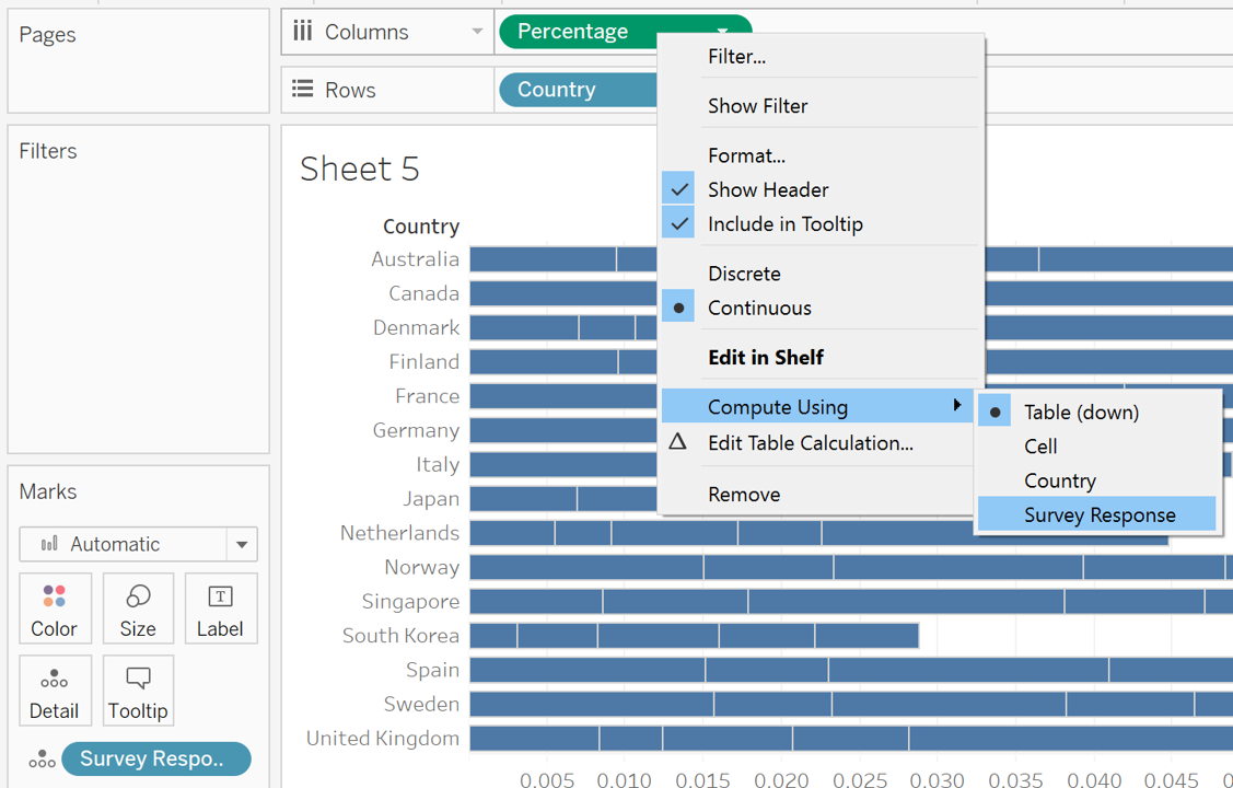
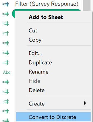
- The following calculated field is also created to ensure that the Survey Response can be filtered without changing the percentage. We will right click this field to convert it to Discrete (Figure 27).
- Filter (Survey Response): LOOKUP(ATTR([Survey Responses]), 0)
- Similar to the diverging stacked bar chart, Survey Question is placed under Filters, as well as Filter (Survey Response). We will right click to Show Filter and the filters will appear on the right of the worksheet. The filters are changed to Single Value (dropdown) and customised to not show “All” value, as it’s not useful to show all options together. The steps were described in Figure 19 earlier. The title of Filter (Survey Response) is edited to Survey Response by Country, as seen in Figure 28.

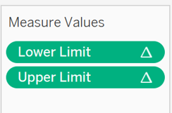
- Next, Measure Values is placed under Columns and only Lower Limit and Upper Limit are kept (Figure 29). They are formatted to show the Percentage in 0 decimal place (as explained in Figure 18).
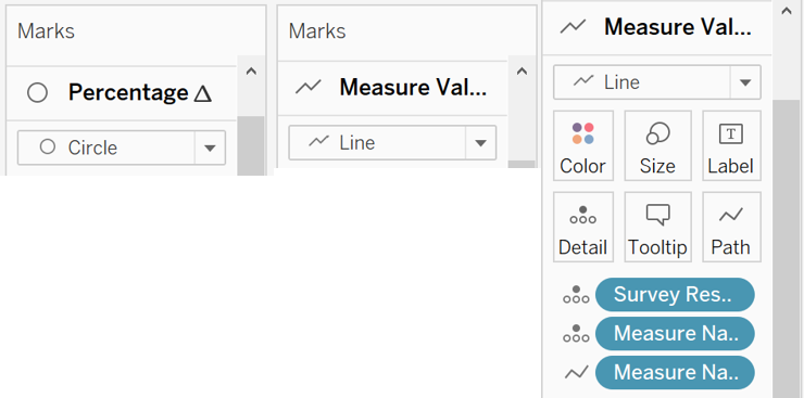
- The data visualisation or chart for Percentage is changed to Circle and that of Measure Values is changed to Line. Measure Names is placed under Path under Measure Values. This is shown in Figure 30.
- Dual Axis is created and the axes are synchronised, as seen in Figure 31. The axis titled “Value”, which represents the upper and lower limit percentages, is hidden, as the percentage can be seen in the bottom axis as well. The field label for row (Country) is also hidden to save space and because they should be easily understood by readers (as explained in Figure 23).

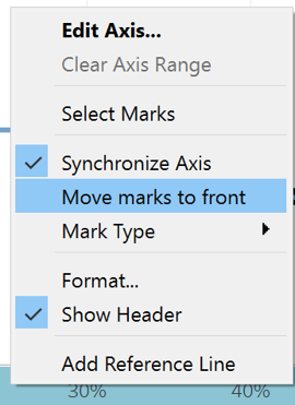
- To bring the dots in front of the lines, we right click the Percentage Axis and clicked Move marks to front (Figure 32). As explained earlier in Figure 18, We will also standardise the axis labels for Percentage to 0 decimal place, with 0.1 tick interval.
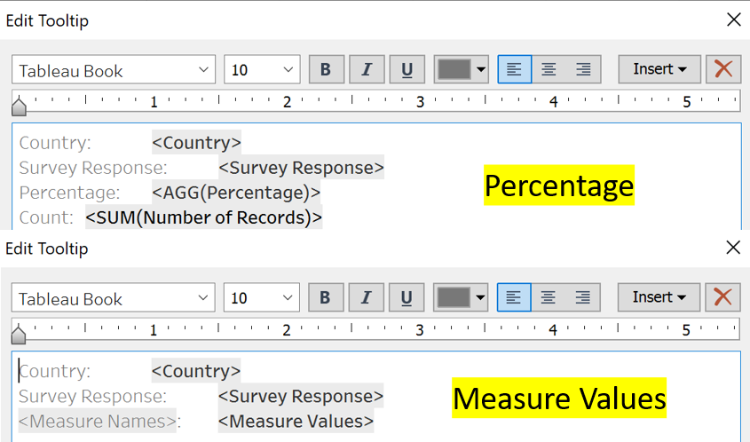
- Number of Records is placed under Detail under Percentage to show the number of survey respondents. The Tooltip for Percentage and Measure Values are edited, as seen in Figure 33. The Title is edited, as seen in Figure 34, to indicate the Survey Response represented by the dot plot.

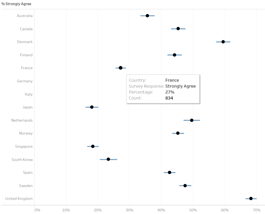
- The Color for Percentage and Measure Values are changed to black and light blue respectively. The worksheet is adjusted to Fit Height (as explained in Figure 22). Figure 35 shows the dot plot with error bars.
Title / Lead-in Paragraph
- Next, we wish to have a title or lead-in paragraph to allow indicate the relevant survey question, overall survey response percentage and number of survey respondents.
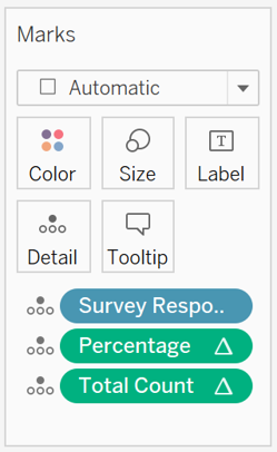
- A new worksheet is created. Survey Response, Percentage and Total Count are placed under Detail (Figure 36).
- Survey Question and Filter (Survey Response) are placed under Filters. We will right click to Show Filter and the filters will appear on the right of the worksheet. The Survey Question and Filter (Survey Response) filters are changed to Single Value (dropdown) and customised to not show “All” value, as it’s not useful to show all options together. The steps were described in Figure 19 earlier. The title of Filter (Survey Response) is edited to Overall Survey Response, as explained in Figure 28.
- The title is edited and Figure 37 shows the interactive title or lead-in paragraph that will be used for the dashboard.

Bar Chart (Breakdown by Demographics)
- Next, we will create a bar chart that will break down the survey respondents by demographics e.g. Gender. This will allow readers to compare and understand the sentiments of survey respondents of different demographics.
- A parameter, Demographic, is created, as seen in Figure 38 and explained earlier in Figure 25. We will right click Show Parameter and readers will be able to select the demographic to show.
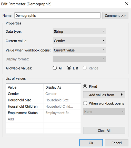
- We will also create the following calculated field (as explained in Figure 13):
- Demographic: IF [Parameters].[Demographic]=“Gender” THEN [Gender] ELSEIF [Parameters].[Demographic]=“Household Children” THEN [Household Children] ELSEIF [Parameters].[Demographic]=“Household Size” THEN [Household Size] ELSEIF [Parameters].[Demographic]=“Employment Status” THEN [Employment Status] END
- Demographic is placed under Rows, Percentage under Columns, Number of Records under Detail, Survey Question and Survey Response under Filters.
- We will right click to Show Filter and the filters will appear on the right of the worksheet. The Survey Question and Filter (Survey Response) filters are changed to Single Value (dropdown). Here, only the Survey Question filter is customised to not show “All” value, as it’s not useful to show all options together. The steps were described in Figure 19 earlier. The title of Filter (Survey Response) is edited to Survey Response, as explained in Figure 28.
- As explained earlier in Figure 18, We will standardise the axis labels for Percentage to 0 decimal place, with 0.1 tick interval.
- The title is edited, as seen in Figure 39. The Tooltip is also edited, as seen in Figure 40.
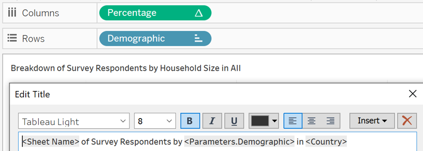

- The field label for row (Demographic) is hidden to save space and because it’s indicated in the title. The step is explained in Figure 23.
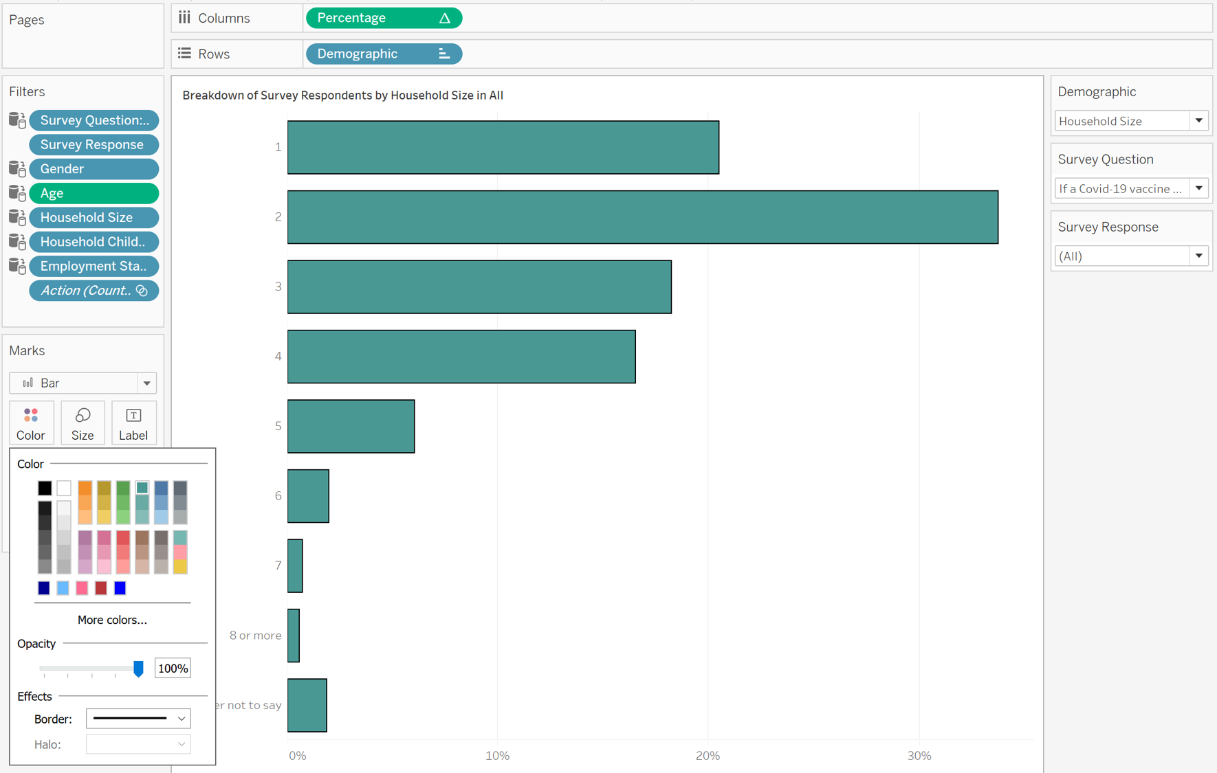
- The Color and Border of the bar chart are changed to make the chart more aesthetically pleasing and clearer. The worksheet is adjusted to Fit Height (as explained in Figure 22). Figure 41 shows the bar chart (breakdown by demographics).
Interactive and Synchronised Filters
- To ensure the applied filters are synchronised across worksheets so that it can be reflected in all relevant data visualisations on dashboard, we will first place all the relevant filters in one of the worksheets e.g. Dot Plot with Error Bars.
- The following are placed under Filters. The filters are shown and the respective properties are applied. The steps were described in Figure 19 earlier.
- Gender (Single Value Dropdown)
- Household Size, Household Children, Employment Status (Multiple Values Dropdown)
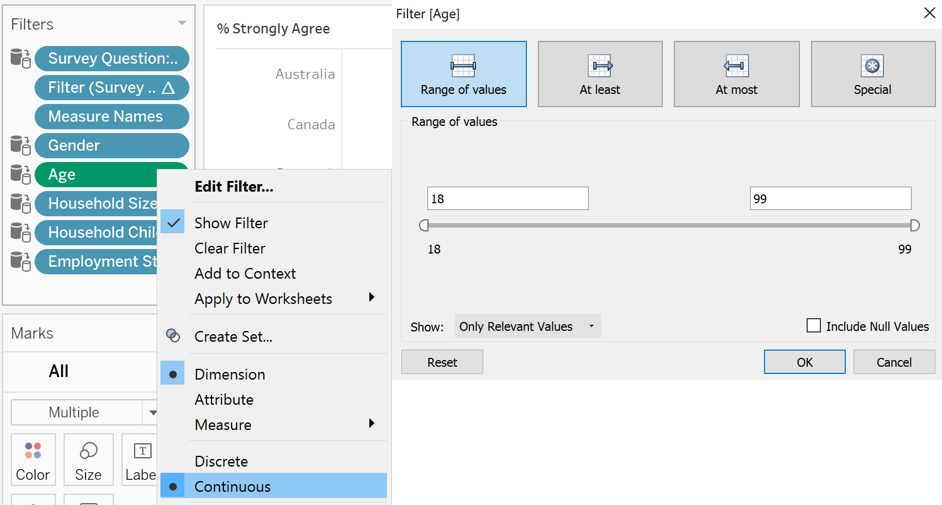
- Age (Change to Continuous, Range of Values) (Figure 42)
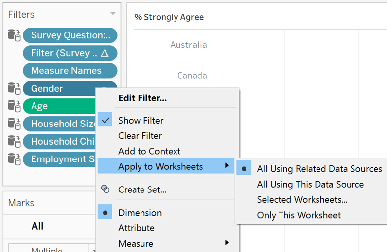
- To apply the filters across worksheets, we right click each of the relevant filters (Survey Question, Gender, Age, Household Size, Household Children, Employment Status) and apply it to all using related data sources (Figure 43).
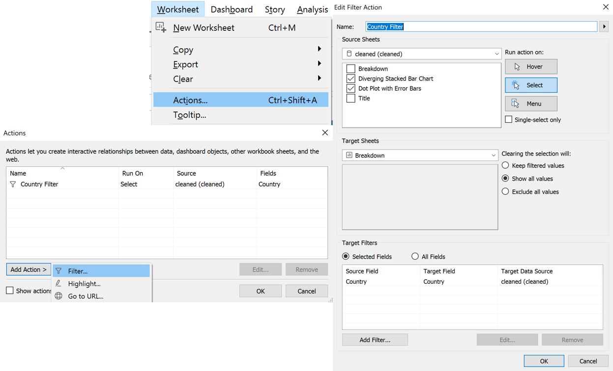
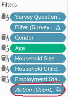
- Next, we wish to make the filter interactive i.e. when we click the country in the dot plot with error bars and diverging stacked bar chart, the bar chart (breakdown by demographics) will be filtered accordingly in the dashboard. Figure 44 shows the steps to create this filter, which is under Actions, Add Action, Filter. A filter action will be reflected under Filters, as seen in Figure 45.
Dashboard
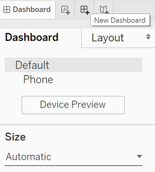
- Finally, the dashboard is created. First, the size is changed to Automatic, as seen in Figure 46.
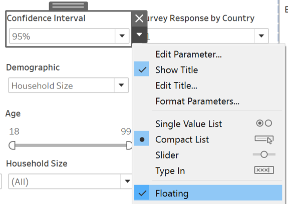
- The 4 worksheets (Title, Dot Plot with Error Bars, Diverging Stacked Bar Chart, Breakdown) are added to the dashboard. Relevant filters are kept in the dashboard and they are changed to Floating (Figure 47) to allow easy size adjustment.
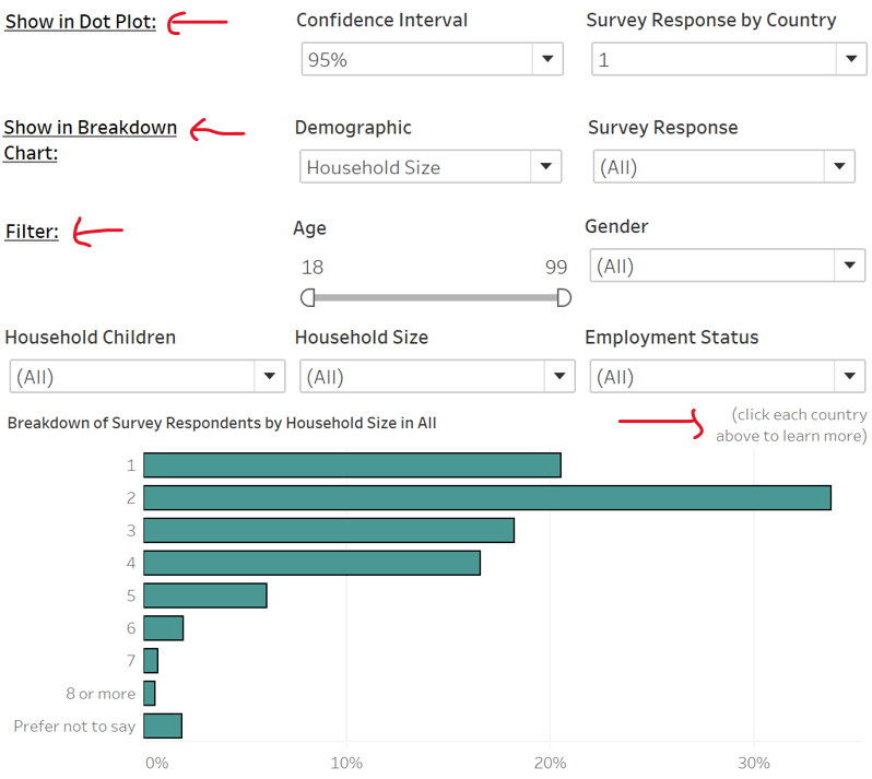
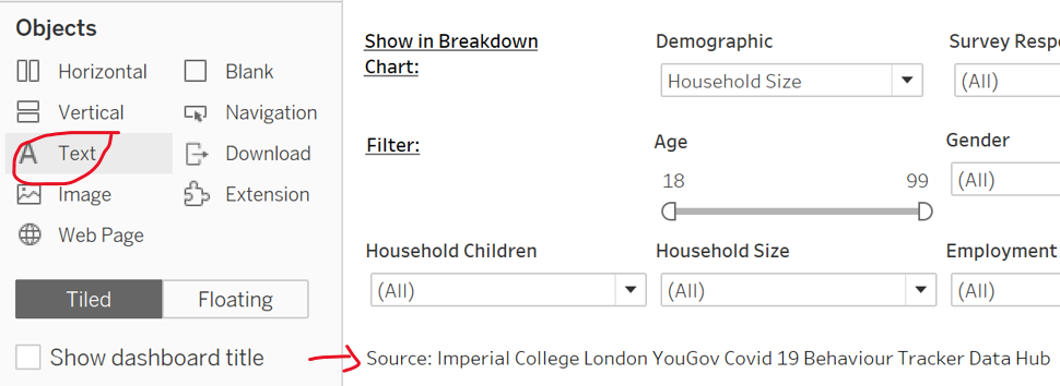
- The relevant test descriptions are added to the dashboard to direct readers on how to use the dashboard. The data source is labelled by adding a Text object (Figure 48 and 49).
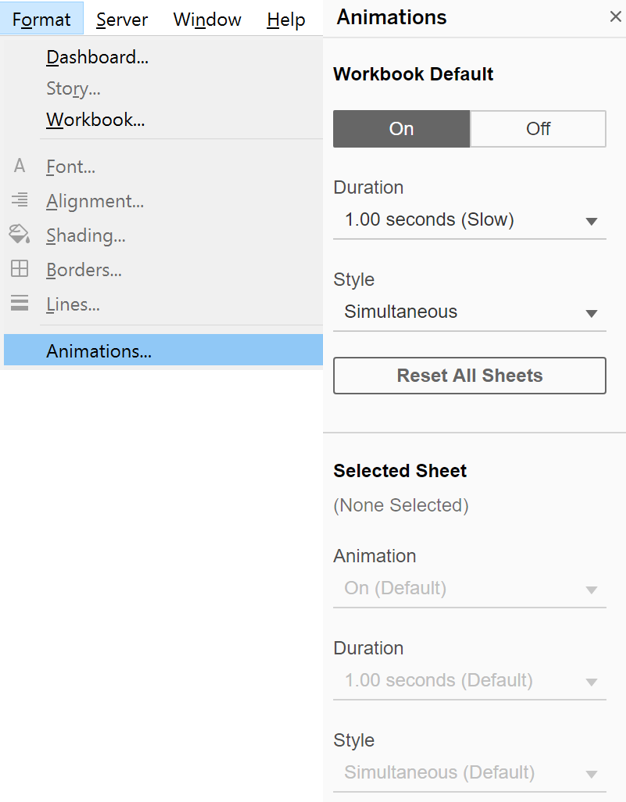
- To allow readers to observe the changes when different filters are applied, the animation is switched on (Figure 50).
- To allow the sorting of the dot plot and diverging stacked bar chart to be synchronised and allow better comparison of survey responses from each country, we go back to the dot plot to create two parameters (Sort By, Sort Order), as seen in Figure 51. Steps to create a parameter was earlier explained in Figure 25.
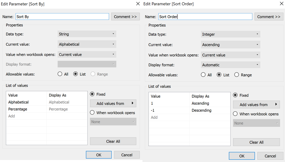
- We will also create the following calculated field (as explained in Figure 13):
- Sort Field: CASE [Sort By] WHEN “Percentage” THEN [Percentage] * [Sort Order] WHEN “Alphabetical” THEN MIN(ASCII([Country])) * [Sort Order] END
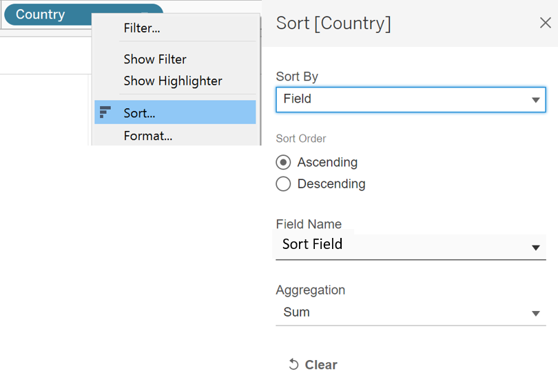
- Sort Field is then applied to sort Country in both the dot plot and diverging stacked bar chart (Figure 52).
3.0 Proposed Data Visualisation Using Tableau
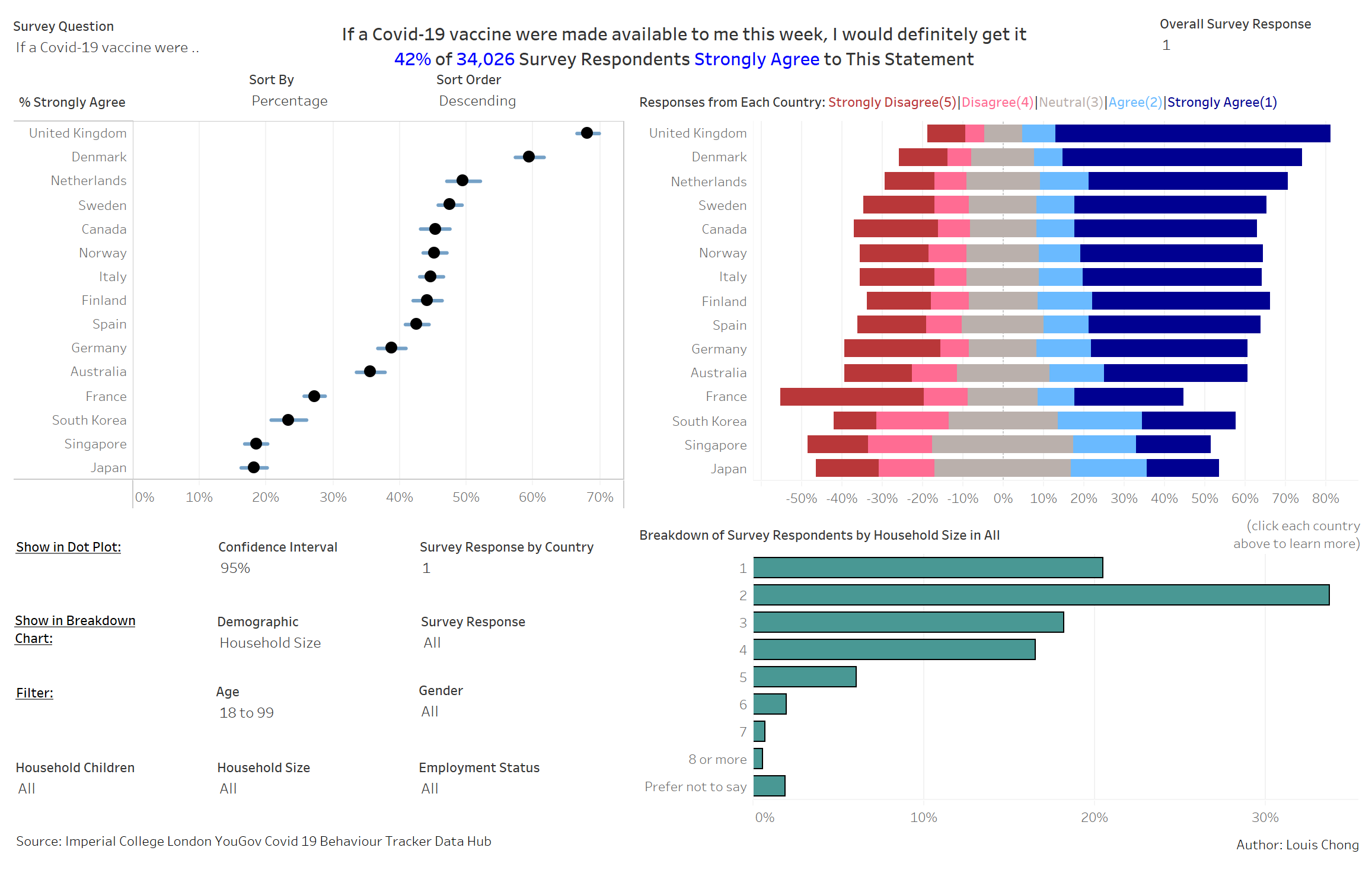
Figure 53 shows the dashboard.
Major Observations
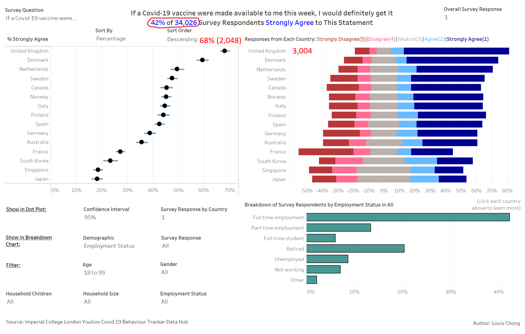
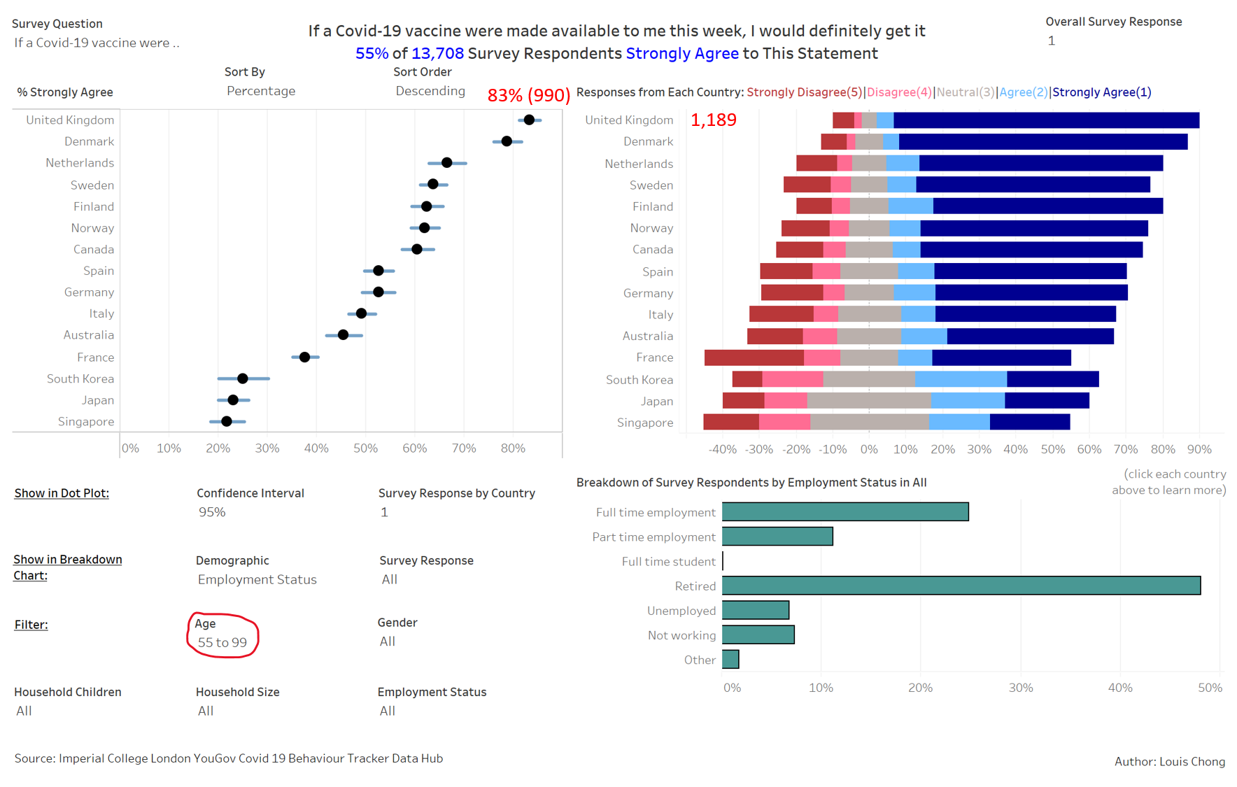
- Observation 1: The United Kingdom had the highest percentage of survey respondents that strongly agree to getting Covid-19 vaccine if it’s available this week. Out of the survey respondents aged 55 and above in the United Kingdom, a huge portion strongly agreed (Figure 54 and 55).
- As compared to the average across countries surveyed (42% of 34,026), the United Kingdom had 68% (2,048) of 3,004 survey respondents that strongly agreed to the statement. This could be because the vaccine is made/tested in UK e.g. AstraZeneca. As such, people in the United Kingdom tend to trust the quality check on the vaccines and are more willing to be vaccinated.
- Out of the 1,189 survey respondents aged 55 and above in the United Kingdom, 990 (83%) strongly agreed to the statement. This could be due to the higher Covid-19 fatality rate among older people. Thus, they are generally more willing to be vaccinated as compared to younger people to protect themselves.
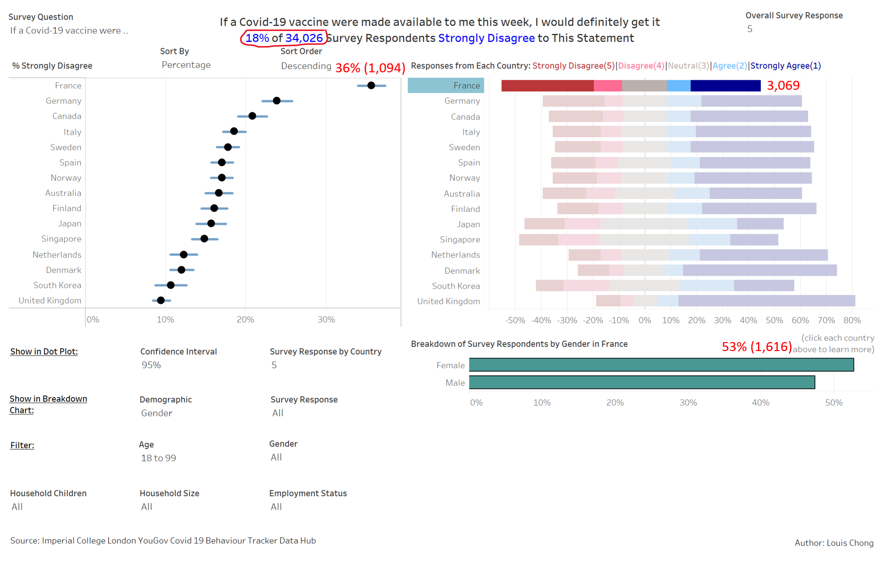
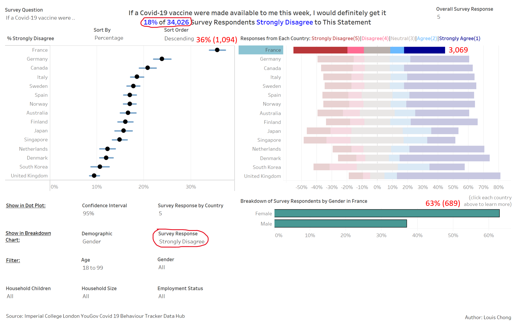
- Observation 2: France had the highest percentage of survey respondents that strongly disagree to getting Covid-19 vaccine if it’s available this week. Women are more likely to strongly disagree than men in France (Figure 56 and 57).
- As compared to the average across countries surveyed (18% of 34,026), France had 36% (1,094) of 3,069 survey respondents that strongly disagreed to the statement. According to CNBC, the vaccine skepticism could be due to public distrust in government and far-left and far-right expression of anti-vaccine sentiment.
- Out of the 1,094 survey respondents that strongly disagreed, 63% (689) is female. Women are more likely to be hesistant about vaccination than men, possibly due to higher fear of possible side effects.
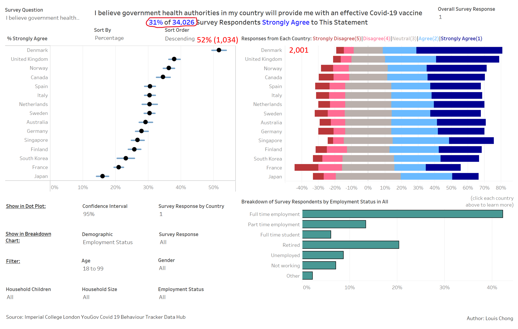
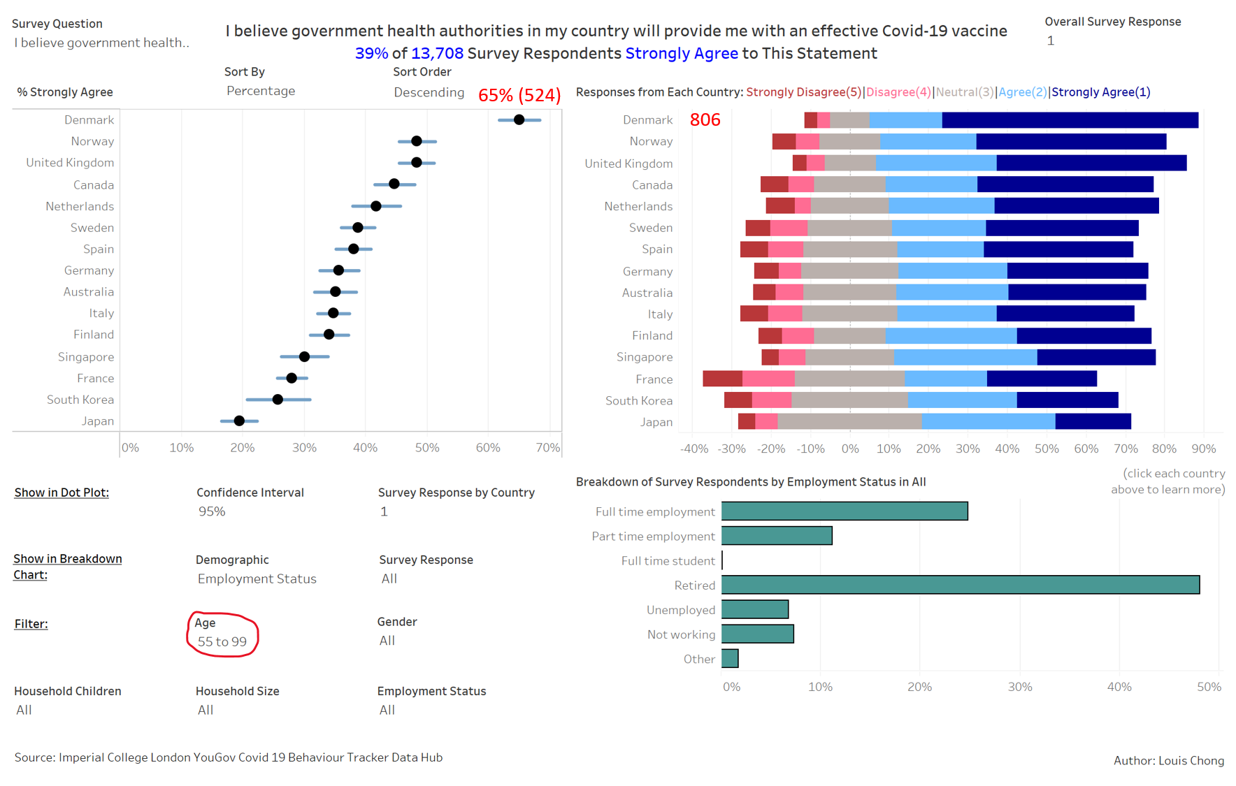
- Observation 3: Denmark had the highest percentage of survey respondents that strongly agree that the government health authorities will provide them with an effective Covid-19 vaccine. A higher percentage of survey respondents aged 55 and above in Denmark will strongly agree (Figure 58 and 59).
- As compared to the average across countries surveyed (31% of 34,026), Denmark had 52% (1,034) of 2,001 survey respondents that strongly agreed to the statement. According to Bloomberg, Denmark has one of the most effective Covid Vaccination Program in EU. Throughout the pandemic, there was clear communication with the public over the handling of Covid-19. Thus, people are more willing to place trust in the government health authorities in providing them with an effective Covid-19 vaccine.
- The percentage is higher for survey respondents aged 55 and above in Denmark i.e. 65% (524) of 806 strongly agreed to the statement, as compared to 52% for all ages. This shows possibly a higher level of trust by the older people in Denmark in the government health authorities.
